We’re simple folk here at Sartorial Soccer.
We know what we like and above all we like simplicity.
We’re not excited about football shirts that can call your mobile phone or elaborate prints of ordnance survey maps being woven into the fabric of our kits.
Yes there’s room for imagination and a bit of graphic flair, but above all we just want to see football kits that work on the pitch and off it.
Asics and Leeds United’s mid 1990s association brought us some of the best Premier League shirts of the era.
In our opinion, the real stars of the show were the first set of away shirts. Generously cut without being baggy, they had clean lines, straight stripes and proper collars, as well as the proper Yorkshire white rose badge. There were no gimmicks and they were elegant in a way that Channel 4’s Football Italia had shown us football kits could be.
Take a moment with us to step back, breathe in, relax and look at what football kits should look like.
Band of Blue & Gold
If there’s one thing to be admired about Leeds United’s home shirts it’s the variety of design they embrace on that brilliant white canvas.

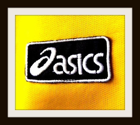
When Asics replaced Admiral as kit suppliers they produced this classic which is still a favourite at Elland Road.

White with a blue and yellow band across the chest, these shirts were worn by Howard Wilkinson’s men for two seasons between 1993 & 1995.
It’s impossible to see this kit and not think of Gary McAllister’s long stride arriving onto a half volley at precisely the correct moment.
Why we don’t see more of those Sampdoria style bands of colour on football shirts we will never know!
Yellow and Blue Stripes
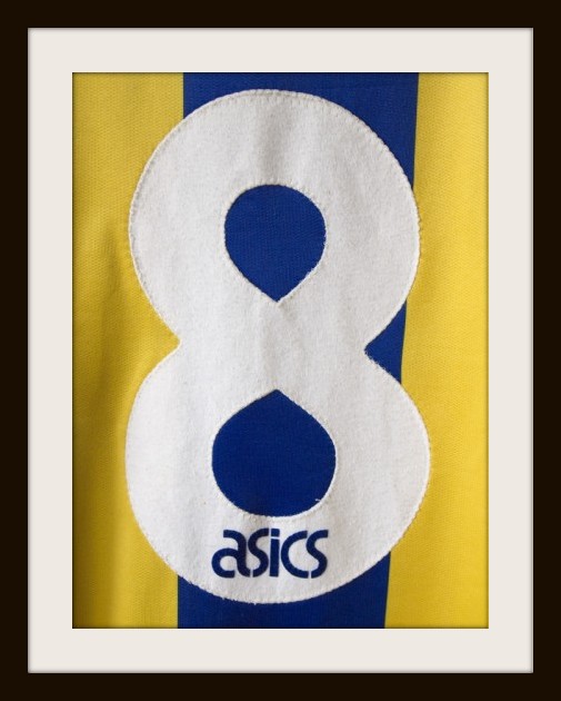
For Asics’ first away shirts they returned to the exceptional blue and yellow stripes that go all way back to the club’s prior life as Leeds City.
Let your eyeballs drink this one in for a moment.
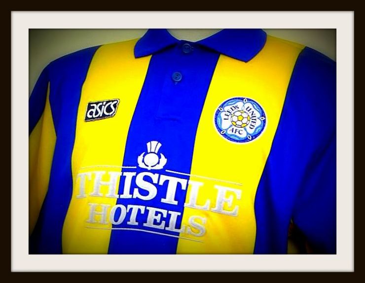
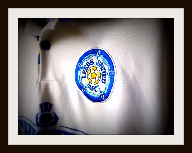
Look at the width of those stripes and that button collar. Look at the perfectly chosen shades of two bold colours and the proud, circular, white rose of Yorkshire badge.
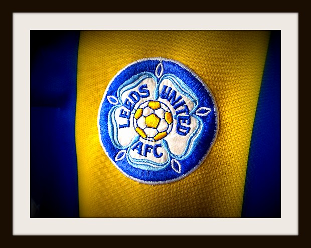
Worn by a side including the great Gary Speed, Brian Deane and Gordon Strachan.
Flawless. 👏
Green & Blue Stripes
In 1994, after a series of kit clashes, Asics furnished the Peacocks with these green and blue striped shirts, marking a clear difference between Leeds’ home and away offerings.
These were different to anything Leeds had worn before and the colours went together much better than you’d think they would.

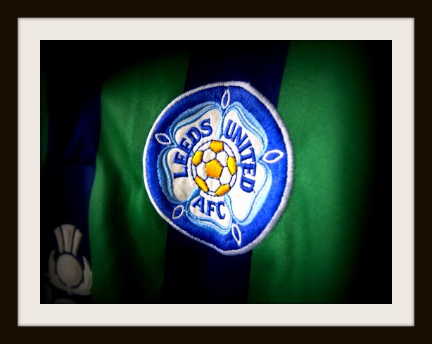
Taking all the key elements of Asics shirts of the period, they were smart and cleanly cut without being flashy.
Players complained that the shirts were difficult to pick out which possibly detracts from their marks for a practical football kit, but you could hardly call these camouflage kits either could you?
We won’t hear a bad word said against these. OK?
Lunar Command Keeper Kit
It’s easy to forget the poor old goalkeeper.
It takes a different kind of animal to think catching a ball rather than heading it is more like fun, and it takes a very special kind of shirt for those nutcases to wear.
Asics may have kept the home and away kits simple but they did what all good sportswear firms should do and made an over-the-top goalkeeper kit, perfect for disorientating oncoming strikers.

Mark Beeney and John Lukic looked a little like they were on the deck of Star Command whilst wearing these between the sticks at Elland Road.
A wonderful shirt which was also worn by Blackburn Rovers, Millwall and Aston Villa’s goalkeepers of the day.
Tony Yeboah’s Striking Strip

Plain, brilliant white with a round neck collar that looked like it could’ve choked a man.

Asics’ second round of home kits never looked like the most comfortable kit to wear but will always hold special memories for Leeds fans due to THAT sensational Tony Yeboah strike.
![]()
In a disappointing season on the pitch, Howard Wilkinson’s men finished 13th in the Premier League and lost to Aston Villa in the League Cup Final.
Even if the collar was a little high, there’s plenty to marvel here, especially the “LUFC” monogram and small circular badge above the Asics logo.
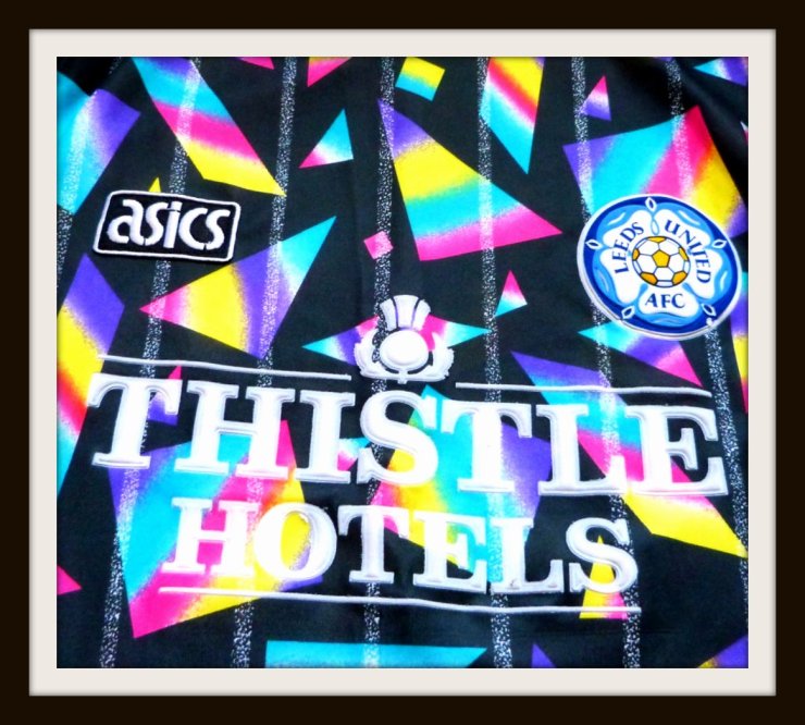
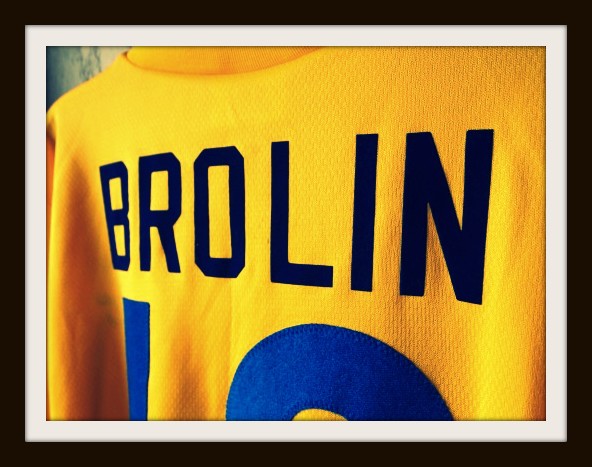
Emergency Yellow Shirt
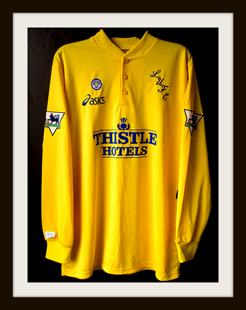

Never officially released for sale to the public, the story goes that these were introduced as an emergency response to placate fans wanting a traditional yellow away kit and players unhappy with the visibility of the green and blue stripes on the road.
As with the home shirts, Asics’ final offering for Leeds United followed a traditionally plain style but featured a far-less throttling button-up collar.
Lucas Radebe had arrived from the Kaizer Chiefs to inspire Ricky Wilson and the Kaiser Chiefs; whilst Swedish star Thomas Brolin particularly suited the colours.
Asics handed over design duties to Puma and it seems we’ve sadly lost the Japanese firm to the world of Sartorial Soccer as they concentrate on items like running shoes.
Oh well, each to his own.
Dear Asics,
Please come back.
We miss you.
Love,
Football
X X X
With special thanks to Leeds Match Worn for allowing us to share some of these images with you.
Check them out at www.leedsunitedmatchworn.co.uk and @LeedsMatchWorn on Twitter for much more!
