When football shirts differ from fans’ expectations, they can take time to be accepted.
Controversial on the Kippax in its day, this Manchester City away shirt is now appreciated for the stunning piece of Sartorial Soccer elegance it truly is, and has achieved a cult status far beyond Maine Road or the Etihad Stadium.

There are many factors that count towards recognition of an iconic football shirt, with stand-out design and colour combination just two.
Yet we would argue that the performance of the team wearing the kit is the greatest single factor in our association with classic kits.
If a team performs badly, our memories of the dross we have to witness on Saturday afternoons can influence our association with the style of shirt.
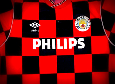
Whilst recognised today for its retro-cool styling, this Manchester City away kit by Umbro played on the fringe of club traditions and unfortunately coincided with relegation to the 2nd tier of English football when it was worn between 1986 and 1989.
City were a world away from league titles and Champions League football when Umbro decked them out in check for the ill-fated 1986/87 season that resulted in relegation from the First Division.
In a break from their more regular red and black striped away shirts, the Citizens settled on a bold and distinctive pattern which drew unfavourable comparisons to chess boards and table cloths, and whilst it may have been ahead of its time; the club have not returned to the design since.
Following relegation, Brother replaced Philips as club sponsors for the 87/88 season, before the shirts formed City’s third kit for the 1988/89 campaign when a team featuring youth-team products Ian Brightwell, Andy Hinchcliffe, David White and Paul Lake achieved promotion back to the top-flight.
In our view, City look best in red and black away kits, closely followed by maroon with white and at a push, fluorescent yellow and navy blue.
The challenge for clubs these days is how they can produce fresh designs each season capable of selling in numbers, whilst keeping on the right side of club traditions.
Perhaps fans were not ready for the revolutionary design at the time, but fans are more used to striking designs nowadays and in a world where Croatia have shown that check patterns can be used for more than just table cloths; a return to the classic kits worn by Mel Machin’s men in the mid to late 1980s would surely be welcomed by the City faithful.
Whilst there was no association with titles and glory for these kits, that would most likely change for City under Pep Guardiola, and with Puma reportedly set to take over from Nike as City’s kit suppliers for next season, we’d love to see them bring back red and black check shirts for those mid-week Champions League trips to the far-flung corners of European football.
Would you like to see Manchester City return to a retro-style check away kit for next season? Please let us know in the comments below!
