The first set of beautifully bespoke kits for the new Canadian Premier League have been released by Macron.
The brand new professional league has seen the formation of 7 clubs across Canada from the Atlantic to the Pacific ocean.
Backed by the Canadian Soccer Association, the CPL’s goal is to improve the standard of the sport ahead of the 2026 World Cup, which Canada will host alongside the USA and Mexico.
Built from the floorboards up, the new league brings together new squads, new club identities and of course, new kits.
Italian firm Macron were awarded a league wide deal to kit out the new teams and the Bologna based manufacturers have effectively been given a blank canvas to design kits for the inaugural season.
Macron’s team of designers worked in partnership with all seven CPL clubs, to provide bespoke uniforms with unique designs. The Canadian Premier League will be one of the few leagues in world football that will have entirely custom-made kits.

Some of those new club identities take some explanation, with most not naming the town, city or region they represent.
More teams are expected to join for the 2020 season, but for now here’s the first threads of the CPL’s magnificent seven charter clubs:
Cavalry FC
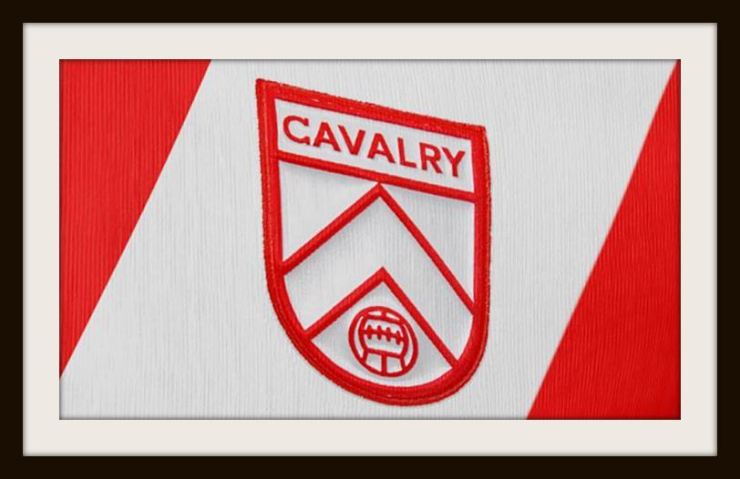


Football thrives on rivalries and Cavalry FC will contest the Al Classico with Alberta rivals FC Edmonton. See what they did there?
Cavalry come from the Calgary metropolitan area and take their name from the Lord Strathcona’s Horse (Royal Canadians) army regiment based in the city, and the club’s away colours echo that military theme in army green and black.
Green also represents the foothills and green lawns of their home at Spruce Meadows, whilst Calgary red represents the city’s established sporting identity.
FC Edmonton
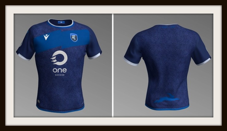


Some clubs are easier to pin on the Canadian map than others, so there are no prizes for guessing that our second new kit comes from, erm, Edmonton.
The Eddies previously played in the NASL and join the CPL after a short hiatus prompted by concerns over the sustainability of professional football in Alberta.
FC Edmonton will wear club colours described as prairie blue sky, river city navy and white rabbit – yes, we said rabbit.
The Rally Rabbit became a club symbol in 2011, when a wascally wabbit ran onto the pitch to upset the rhythm and concentration of rivals Montreal Impact (who would later join MLS) to the delight of the Edmonton faithful.
Forge FC

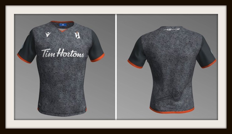
Hailing from Hamilton, Ontario, Forge FC will play at Tim Hortons Field, but won’t look like doughnuts in these sharp new kits.
The name was chosen to represent city’s industrial heritage and the club will forge a footballing future in spark orange, platinum steel and waterfall white.
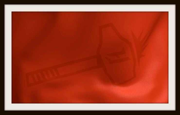
Forge’s first kits are among the most eye-catching in the league with the secondary emblem of the hammer and spark details featuring prominently on the home shirt.
Forge’s “local” derby with York 9 will be the closest in the CPL, but at 43 miles apart the two clubs would be the farthest neighbours in UK football where Ipswich and Norwich’s rivalry is separated by a mere 40 miles.
HFX Wanderers FC

There’s a wonderfully nautical feel to the shirts of HFX Wanderers of Halifax, Nova Scotia who list their club colours as aqua ocean, naval grey and harbour blue.
Halifax is home to the Royal Canadian Navy’s Atlantic headquarters and the new club’s badge has several references to Nova Scotia’s seafaring heritage including the obligatory anchor, whilst the away shirt features a zig-zagging wave pattern throughout.
HFX Wanderers have proudly included a motto in Scottish Gaelic under the crest and on the back of the home shirt. “Ar Cala, Ar Dachaigh, Ar n-Anam,” which translates as “Our Harbour, Our Home, Our Soul.”
Fun Fact: HFX Wanderers boast the Trinidad and Tobago international Elton John on their roster.
And we guess that’s why they’ll call them the blues!
Pacific FC


Games between Pacific FC and HFX Wanderers will see fans travel the third-longest distance in domestic professional soccer globally, with the two teams separated by 2,781 miles.
Pacific are from Langford on the southern tip of Vancouver Island, British Columbia and will call the Westhills Stadium home.
Vancouver Island and the ocean are central to Pacific FC’s identity with the shape of their club badge representing fir trees and club colours described as sea star purple, lagoon blue, and lighthouse white.
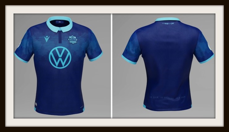
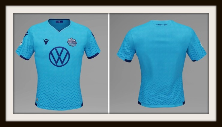
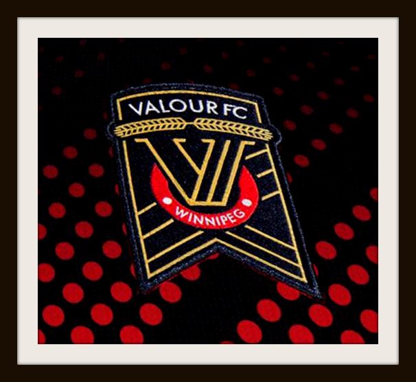
Valour FC


A club named in honour of the Winnipeg men who left Canada behind to fight in the First World War.
Those gallant young men included 3 recipients of the Victoria Cross who all grew up on the same street, which was later re-named as Valour Road in tribute to their heroism.
There is a clear military influence behind the Manitoba men’s official club colours that mirror the ribbon of the Victoria Cross and are described as valour maroon, wheat gold and earth black.
We’re not sure whether the inspiration behind the red polka-dots arranged in diagonal patterns on a black background was the poppy fields of France and Belgium, but the result is truly one of the best CPL shirts on show.
York 9 FC
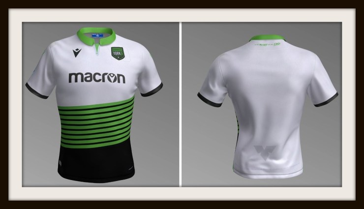


First let’s start with that name.
York 9 represent the 9 municipalities that make up the York Region close to Toronto.
Macron have given Jimmy Brennan’s boys a winning look ahead of the Canadian Premier League’s big kick-off this month, with a truly unique design which makes the 9 stripes of the club badge the home kit’s main feature.
The official club colours are electric green, charcoal grey and black. The shade of green represents the York Regional Forest, as well as the club’s intended construction of an environmentally friendly wooden stadium.
What do you think of Macron’s new kits for the Canadian Premier League and if you had to choose a favourite, which one would it be?
Please let us know in the comments below!
All images are courtesy of Canadian Premier League.
