Cast your mind back to the summer of 1994.
After a stateside World Cup full of razzmatazz and missed penalties, Nike were the brash, untrusted upstarts on the Premier League block, bringing their swoosh to the marble halls of Highbury, where they would have a major impact on football kit design for the next 20 years.
Across London, in fashionable Chelsea, Umbro had launched a new away shirt in colours so daring they were in danger of burning the retinas of those forced to wear them.

Perhaps those graphite and tangerine away shirts were ahead of their time?
Perhaps the Premier League was not ready for the barage of brutalist concrete, chicken wire and fire that Umbro had crafted into a shirt that would be worn by Glenn Hoddle’s boys as they finished 11th in the Premier League and reached the semi-finals of the Cup Winners’ Cup?
Now imagine for a moment that Nike had turned up at Stamford Bridge rather than Arsenal, and that Robert Fleck had become Nike’s poster-boy of the day rather than Ian Wright.
How would the American firm have designed an away shirt for Chelsea twenty-five years ago?

Well, if you’ve ever paused and searched for the answer to that question, then wonder no more, because Nike have given us a 21st Century interpretation of that crap/classic shirt with the launch of Chelsea’s new 3rd kit for the 2019-20 season.
Those with an eye for these things tell us that the 1990s are back in fashion, and across the stable of major clubs on their books, Nike have brought a throw-back theme to their designs, complete with the old Futura logo, intricate jacquard patterns and “of-the-era” colours and collars.
Rather than bring us a straight-forward retro re-work of the shirts donned by Ruud Gullit in his first Chelsea season, Nike have gone back to black – a colour which was almost as controversial as grey back in the 1990s – and finished the whole thing of with period details including a contemporary Borussia Dortmund style collar.
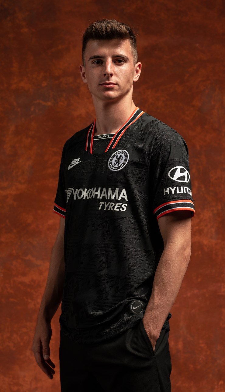
What the inner-nerd in us absolutley loves about these shirts is how far Nike have gone to celebrate the work of legendary kit designers like Drake Ramberg.
With Chelsea’s away shirt being mostly white, you get the feeling that this alternative top is going to see lots of action across all competitions, and that the most talked-about football kit design of the last seven days will live long in the memories of Blues fans.

