There’s only so much you should ever do with a QPR shirt and it really isn’t something that should be that difficult to get right.
That said, at various times in the past few years, Lotto and Nike made a terrible fist of things.
The issue for manufacturers when a kit is as established as those of Queens Park Rangers, is how do you succeed in bringing fresh innovation each season whilst satisfying club traditions?
For QPR fans, there were none of the leaks and speculation on styles we’ve seen for other clubs this year, just a message pinging into their phones to say that their 2020-21 kits had been revealed.
The excitement, anticipation and trepidation of those seconds between receiving that automated message and the link opening on screen, revolved around one over-riding concern:
Please Erreà, please don’t f*ck up the hoops.

Let’s start with the positives.
Erreà are into their fourth season with the Superhoops and this season’s home, away and goalkeeper strips are clean cut, individual and tick most of the right boxes.
The bespoke home shirt with plain shoulders and sleeves reminds us a lot of the Influence Leisurewear kit worn by Rangers in the old First Division, but thankfully, there’s no return for the old vicar’s collar which is replaced by a neat red-trimmed v-neck.
With proper bona-fide Hoops rather than horizontal stripes divided by panels on the back and sides, Erreà have avoided the mistakes of Nike and Lotto that very nearly prompted riots along South Africa Road.
As a major improvement on last season’s design, and as one of those little aesthetic preferences, the R’s crest is placed in white on a blue hoop.

Sometimes it’s the little details that matter, and it’s also those little details that nag at football fans when a new kit is unveiled.
A snag which has split opinion among fans is the amount of white across the the shoulders.
Perhaps an additional band of blue at the very top of the shoulders would have set these off nicely, but this is where Erreà have succeeded in bringing something a little different.
Best of all, new sponsors Football Index’s branding blends into QPR’s kits far, far better than the intrusive, out of place logo of previous backers Royal Panda, which was often pasted across two hoops in what always looked like an after thought.

If the home shirt is heavily influenced by those of the late 80s/early 90s, then QPR’s smart away kit in red and black recalls those worn in the 1982 FA Cup Final.
There will be those who will always wish to see the R’s in the classic Dennis the Menace style introduced by Adidas the following season, but we applaud Erreà for bringing a fresh, modern take on those simple red shirts with white trim.
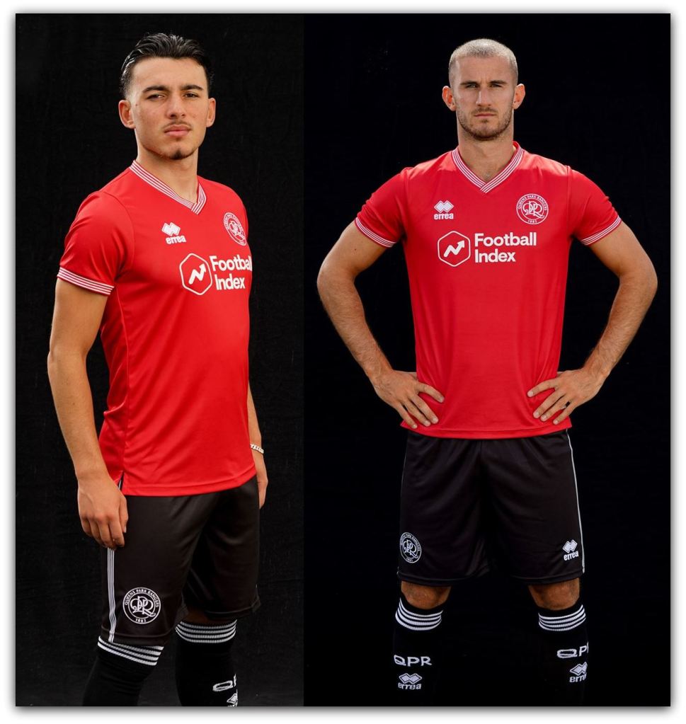
The away kit has already proved popular with the Loftus Road faithful and we sneer at any suggestion these are too similar to Macron’s Nottingham Forest shirts just because they might share the same sponsor and are . . . well . . . red with white trim.
To round things off nicely, Erreà’s contribution to the goalkeeping department brings to mind the luminous shirts manufactured by Brooks for Jan Stejskal and Tony Roberts in the final year of the First Division, but in a much more refined manner.

OK, they’re not quite as classically cut as those home colours we saw from Dryworld, and they still feature the obligatory gaming sponsor; but overall these are refreshing designs that work within QPR’s pallette of colours.
More white than blue, the home shirts will certainly split opinion but after a few days to dwell on Erreà’s designs, we think they’ve done an admirable job in updating one of the game’s most beautiful and iconic kits.
What do you think of QPR’s 2020-21 kits by Erreà?
You may also like: Pure Genius: The Classic Combination of QPR & Guinness
