The release of Erreà’s experimental Norwich City third kit certainly ruffled a few feathers in the Championship this year.
Of course the comparative rarity of yellow as a primary club colour, means the Carrow Road outfit shouldn’t really have too much call for a third kit as long as their away strip gives enough of a contrast to that of Watford, and at a stretch, teams in white like Derby County or Preston North Ed.
Having said that, after a neat home and slightly controversial petrol blue away kit, it’s great to see Erreà and Norwich City bringing something a little more esoteric to their fanbase.

Kayleigh Coverdale, head of retail at the club said:
“We are really pleased to launch our third kit, which we believe is a vibrant, modern kit that offers something different for our fans from the home and away.”
The Canaries’ 2020-21 third shirts are predominantly black with a bold pattern of intersecting shapes in fuchsia, white and purple creating a disruptive hooped effect to the overall design.
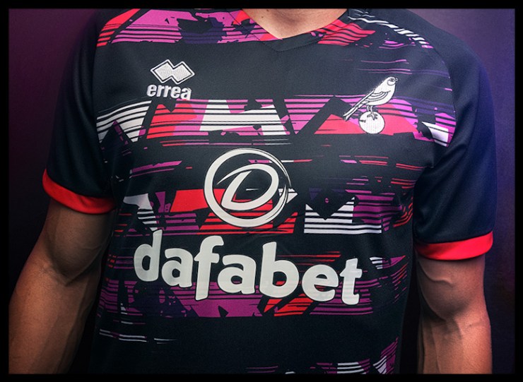
The real detail that makes this shirt sing comes with the separation of the Canary emblem from the constraints of its usual shield on the left side of the chest.
The rare sight of City’s songbird sitting away from the traditional lion and castle gives the shirt a more contemporary look, whilst the addition of black shorts and socks gives the whole playing kit a modern, cohesive feel.
This is a truly unique third shirt for the Canaries and should this prove to be a successful season for the club, this colour scheme may become a neat addition to their regular repertoire.

