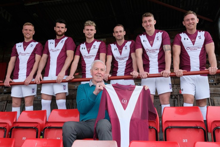
As York City prepare to leave Bootham Crescent, the club have unveiled a commemorative kit based on their classic Y-Front shirts of the 1970s.
Kit suppliers Under Armour have released a special version of the Minstermen’s famous Y-Front shirts of the mid-70s, to be worn in the final competitive match at their historic home later this year.
The National League North club have called Bootham Crescent home since 1932 but will move to a new Community Stadium at Monks Cross next season.
York City and their old ground have survived the Luftwaffe, numerous promotions, relegations and financial threats on their existence; as well as the ignominy of the 2005 sponsorship deal that saw their city centre home renamed Kit Kat Crescent.
The white and maroon Y-Front look was originally worn during the club’s 2 seasons in the 2nd tier of English football back in the mid-1970s, and is still a very popular look for City’s supporters.

The first run of shirts, produced solely in adult sizes, we’re snapped up by York’s fans within 3 hours but fear not, Under Armour plan on releasing more stock ahead of the last big day at Bootham Crescent.
Club legend goalkeeper, Graeme Crawford who played every match of York City’s 2nd tier spell between 1974-76, was on hand for the promotional pictures, commenting:

“It was also a lucky shirt back in the Seventies and, hopefully, it will be as lucky again,” he added.
“The new version puts a modern take on an old design and I really like it.”
Couldn’t have put it better ourselves!
What do you think of Under Armour’s update of the club’s iconic Y-Front look, and should City use the design on a more regular basis?
Please let us know in the comments section below!

