It’s always a hoot when a club updates their badge, so we were delighted to see Oldham Athletic launch a brand new crest ahead of the forthcoming League Two campaign.
A football club’s badge is vital to their identity, so any attempts to tinker with them are often met with fierce resistance from fans.
After all, who wants to pay for expensive and painful tattoo removal procedures?

However, the case of Oldham Athletic, who revealed a revived crest over the weekend, shows that if you consult with fans and pin the design back to your history and heritage, then you are on to a winner.
The Latics have updated a favourite badge from their past, giving their wise old bird a refreshing makeover for the digital age.
Oldham’s fans were given the chance to select their favourite design from a shortlist of three potential crests, with the simplicity of the owl on ball their clear choice.
Last season, the club marked their 125th anniversary with a retro-rework of the badge worn in their Premier League era.
This showed that the modern crest, adopted as recently as 2011, needed to be redesigned with a more traditional look the desired result.
The winning design takes it’s cue from the one used by the Latics during the 1960s and ’70s and includes a neat little nod to the club’s heritage in the form of a font reminiscent of the signage fixed to the stands of their Boundary Park home.
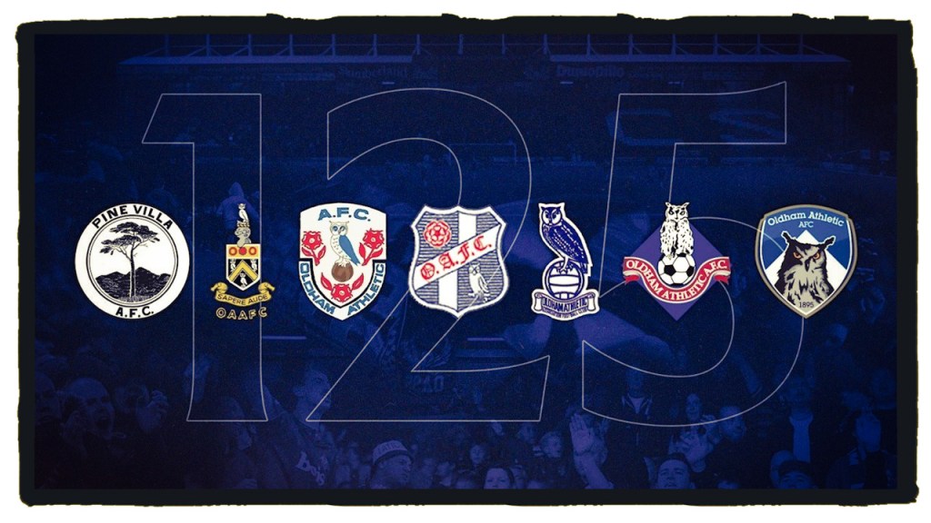
The Oldham owl has perched upon the football club’s badge in various guises across the decades and is symbolic of the Greater Manchester town itself, featuring on the coat of arms and inspiring the motto – “Sapere aude” (“Dare to be wise”).
The shape of the new badge is distinctive in itself and represents a departure from the conventional, social media friendly “roundel” we’ve come to expect from crest updates in recent years.
The “bird on ball” may be a staple of English club crests from Norwich City to Tottenham Hotspur and Bristol City, but Oldham have done enough to make theirs sing.
As fantastic a design as this is, it feels like a shame that the wording must sit below the owl, yet that is just being picky.
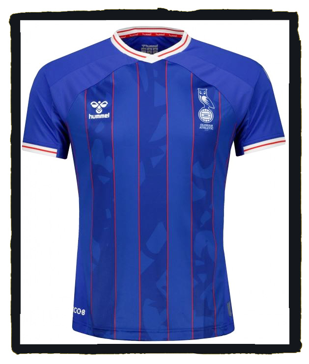
As part of the release, Keith Curle’s boys also got to see how the crest would sit on their 2021-22 home strips.
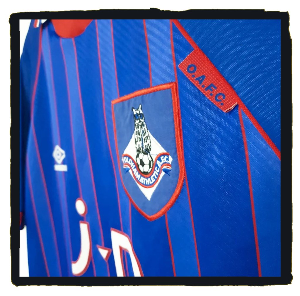
Oldham’s technical partners Hummel have done what Hummel do best with a fitting tribute to the club’s classic 1993-95 shirt from the last season of Joe Royle’s Premier League tenure.
Oldham Athletic can be commended for adopting a design so perfectly in tune with club tradition, which also shows that the involvement of fans is a key step to a successful rebranding exercise.
This is a lesson in how you should go about updating a football club badge.
