From the clean and classy 1990s styles of Mizuno, to the home-produced kits that were so good they could’ve hung on your wall; Port Vale’s kits have always been more than just a matter of black and white.
We’re delighted ro welcome a very special guest to Sartorial.Soccer in the form of BBC Stoke reporter, producer, presenter and football commentator, Phil Bowers, who also just so happens to be a massive fan of the Valiants!
Phil has been following the fortunes of Burslem’s finest since his Dad took him to Vale Park for the first time in 1990, and across a three-part series, he will take us on a trip through some of the club’s most memorable shirts.
Over to you Phil!
The classic black and white motif, combined with the black and gold away colours (with the odd bit of blue thrown in), has defined the club for decades, and even when the club have endured some of their darkest years, they’ve had classy kits to go with them.
It’s really difficult to make a mess of a Port Vale kit.
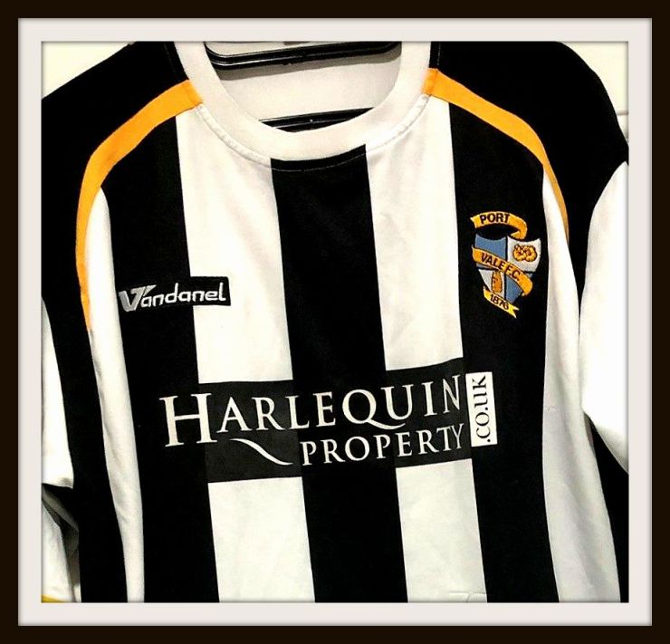
Although it does happen occasionally as seen with this stripey Vandanel effort below.
The best place to start is just after John Rudge began to turn things around after replacing John McGrath back in the 1980s.
In 1988, Vale gained national attention by upsetting Tottenham Hotspur 2-1 in the FA Cup, a giant-killing result that is still remembered fondly by fans to this day.
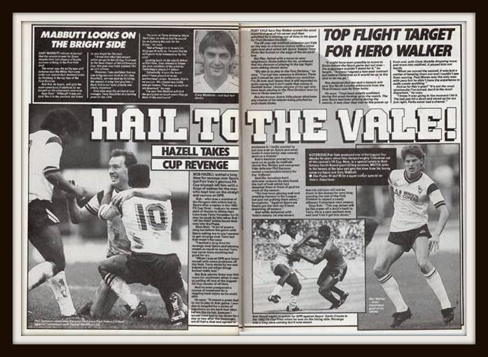
A team featuring the talents of Phil Sproson, Robbie Earle and Ray Walker wore a kit made by little known company New Olympic, and sponsored by Minolta.
It was one of the few times at that point that Vale’s simple all-white shirt had featured additional details with the black flashes on the sleeves and shoulders.
The overall design remained similar when local company Bourne Sports began making the club’s kit the year after, with away shirts at this point largely reflections of the home kit, but in 1990, things drastically changed.
Shirts resembling explosions in paint factories were common during this decade, but the other favoured design theme at this point was producing football shirts that you might find your mum and dad wallpapering your front room with.
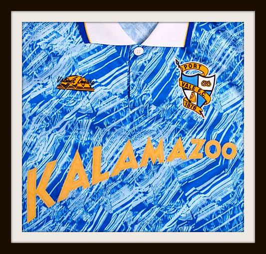
Vale began to make their shirts in house through the label Valiant Leisure, and their first home shirt became synonymous with the likes of Martin Foyle and Robin Van Der Laan.
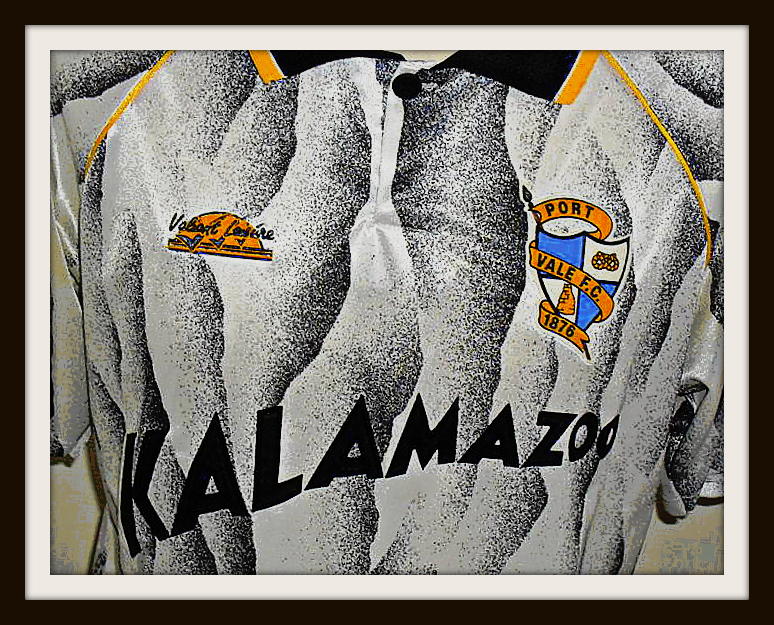
The distinctive silver Anaglypta design was a big hit with fans who embraced the radical difference.
The away kit was a laser blue design with yellow trim, which again was eye catching and diverged from the traditional gold colours.
We were now entering Vale’s golden era, with John Rudge assembling some great talent, featuring the likes of Dean Glover, Ian Taylor and Kevin Kent.
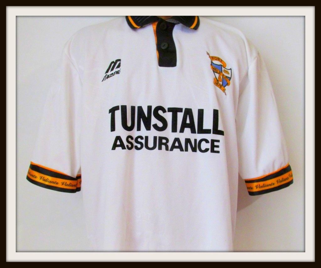
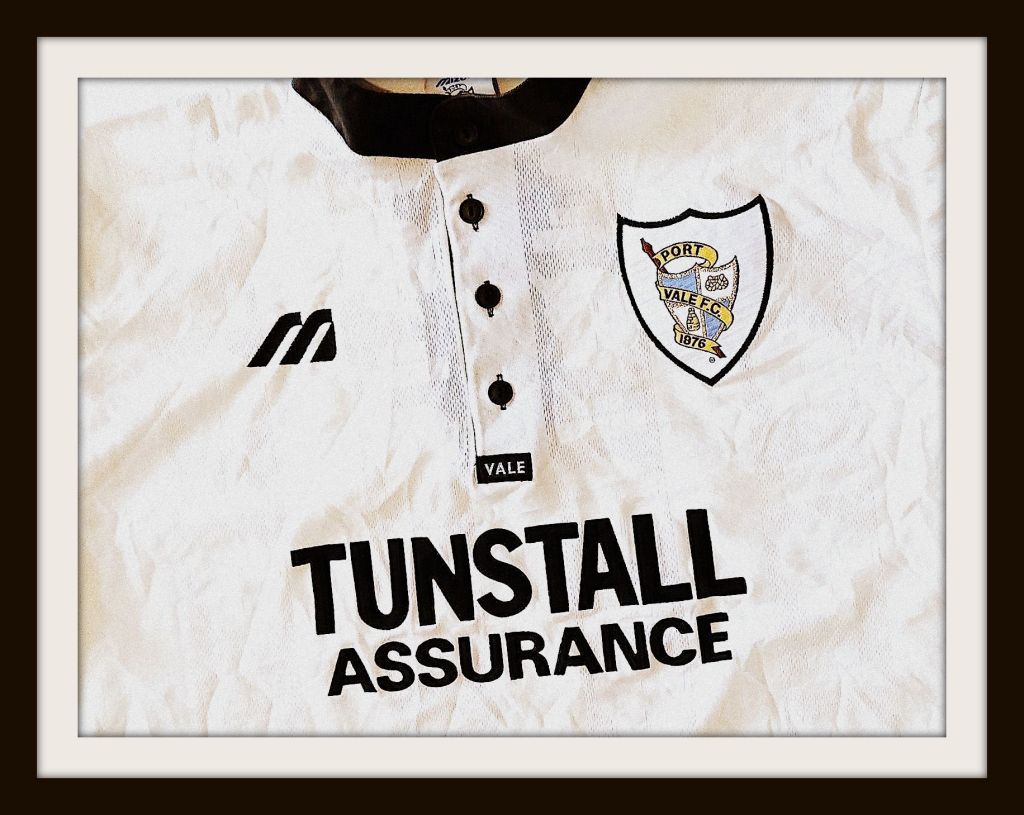
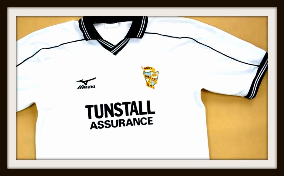
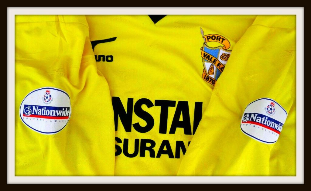
Stoke-on-Trent based Tunstall Assurance took over as the main shirt sponsors, and the era coincided with some fantastic results in Vale’s history.
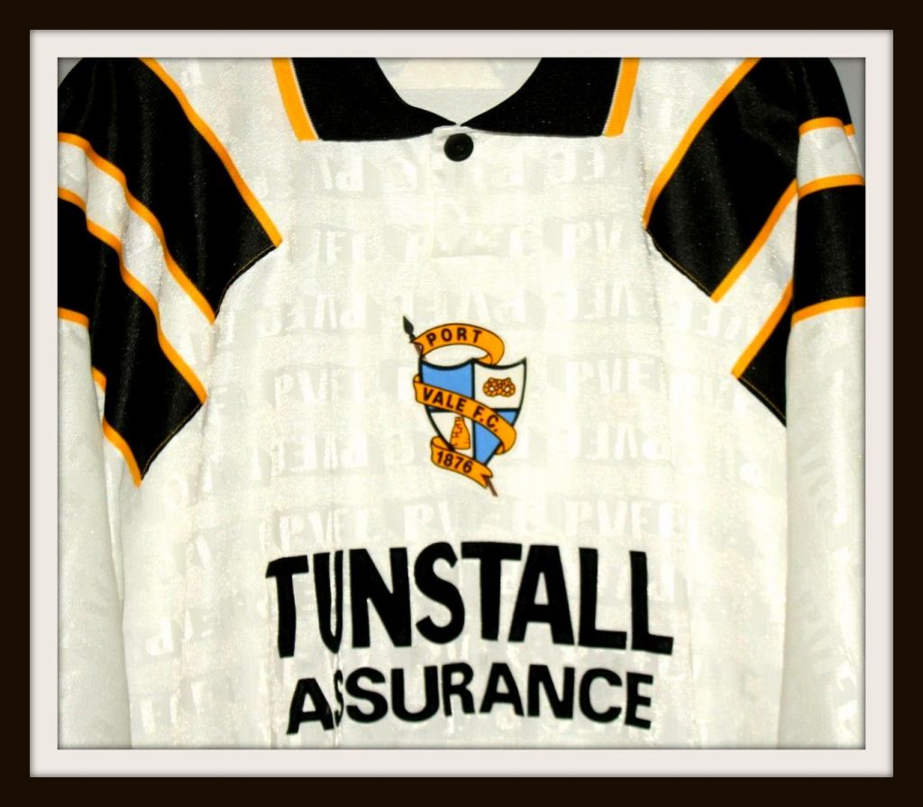
Bernie Slaven immortalised Valiant Leisure’s second home shirt design, with its shoulder flashes taking inspiration from Liverpool’s kits of the time, when he scored to secure victory in the 1993 Autoglass Trophy final against Stockport County.
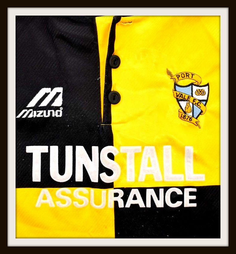
By this point the Vale had reverted to the black and gold away design and there was more freedom associated with that.
Stripes and quarters were the order of the day as Steve Guppy and Jon McCarthy began to dazzle crowds, feeding the likes of Tony Nayor and Lee Mills who had been brought in to spearhead the club’s attack.
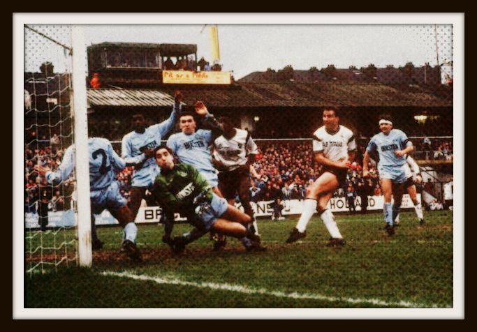
And the gold came to embody one of the greatest kits in Vale’s history, as Rudge put together a team that challenged for promotion in the old First Division, and came up with another FA Cup giant-killing when Everton came to Vale Park in 1996.
The cup holders were shocked by Vale who earned a 2-2 draw at Goodison Park, but that was nothing compared to the replay in Burslem, as Rudge’s team outplayed the Premier League outfit.
Ian Bogie and McCarthy scored to see off the top flight side, and the kit was etched into supporters’ collective memory.
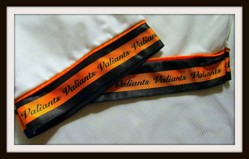
Mizuno had only started making Vale’s kit that season, incorporating the gold with the word “Valiants” inscribed on the cuffs and shorts.
The classic design was much loved, and if you ask any Vale supporter what their favourite all-time kit was, this would be right up there.
But all good things must come to an end, and with a change in kit, came a change in fortunes.
The gold disappeared in 1997, with a simple button down black collar, and the word “Vale” stitched into black bands on the sleeves. Rudge’s years of success were coming to a close, and the departure of star player Gareth Ainsworth proved to be a huge obstacle.
Vale only stayed up on the final day of the season with a 4-0 win over Huddersfield.
The following season, Vale dispensed with black shorts and socks, and Mizuno produced an all-white number that has mixed emotions for Vale fans.
It saw John Rudge sacked as the club struggled at the foot of the First Division, and ended in eventual relegation after a 2-1 home defeat to Huddersfield.
There were some good footballers arriving at that time: Marc Bridge-Wilkinson, Dave Brammer and goalkeeper Mark Goodlad to name a few, and Vale kept the all-white ensemble the following season.
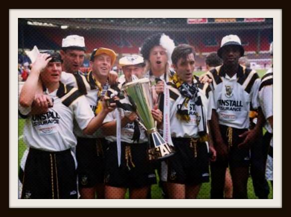
It didn’t start well with a 4-1 home defeat to Oldham, but over time, something changed, and new boss Brian Horton, who had taken over from Rudge, moulded a side that went on a 16 match unbeaten run that saved them from relegation, and more famously, saw them lift the Football League Trophy at Cardiff’s Millennium Stadium.

It was probably a good thing they wore the gold away kit from that season when they beat Brentford 2-1, as that shirt became synonymous with Tony Naylor’s 20-goal haul that season, as well as the emergence of players like Steve Brooker and Micky Cummins, who would become stalwarts of the team over the next few years.
In Part Two: Phil returns to chart the mixed fortunes of Vale’s next bunch of kits and discusses how some of their best strips have coincided with some of the worst teams to have pulled on the shirt!
In the meantime, you can follow him on Twitter here!
What’s your favourite Port Vale shirt?
Please let us know in the comments section below!


My favorite is the shirt of mid 1970s with black and white striped sleeves!
LikeLike
The Mizuno kits were obvious classics with my favourite the final home one from 2000/01. Such a clean, classic design.
More recently I loved the Sennhiser sponsored Vandanel home shirt too.
Both bad seasons, but good kits.
Again, the Bruno era Errea one was another classic with the yellow and blue stripes.
Dreadful season. Great kit.
Conversely our promotion season had a horrible shirt. The UK windows system shirt was awful quality with the transfer sponsor cracking and fading after maybe 5 washes.
LikeLike
Expect some of those in Part Two! 👍
LikeLike