Excuse the terrible attempt at Latin for a moment, the Shirt Merchants of Venice are back and if you were concerned about how they’d fair after the adoption of Kappa as technical partners, then you needn’t have worried!
Although hardly one of Italian football’s glamour clubs on the pitch, Venezia have been punching above their weight in terms of profile and attention in recent years and the colossal reach of Nike’s marketing machine played a huge part in that.
Together with creative agency Fly Nowhere and Diego Moscosoni, the creative forces behind those world-beating designs; Venezia’s unique Arancioneroverdi colours became a must have for kit collectors and a regular feature at the top of those annual polls of the most beautiful football shirts on Planet Earth.
After their hugely successful partnership with Nike came to an end amid rumours of creative differences and suggestions that their first season back in Serie A after 19 years would be played-out in . . . God forbid . . . standard-issue teamwear . . . everyone interested in the twin passions of football and fashion couldn’t wait to see what Kappa would bring to the table.

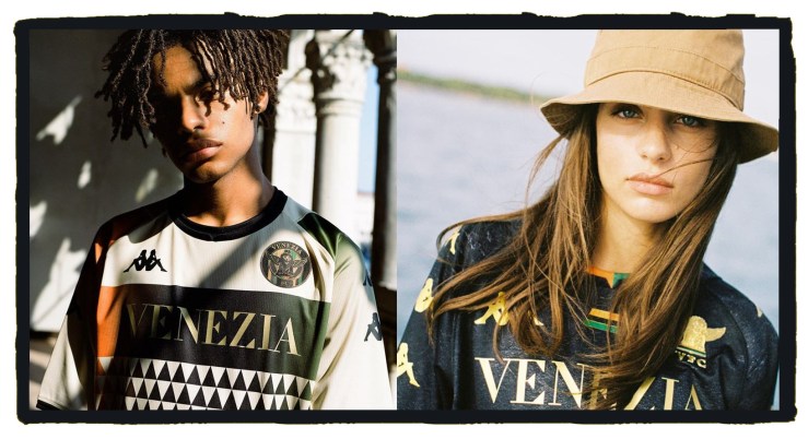
Released with what has now become the club’s custom for an arty photo-shoot with beautiful people wearing their shirts in glamorous locations around Venice, Kappa’s debut designs tease the senses in a more nuanced way than the bold, block colours of last season’s strips.
Cast onto the familiar cut and chassis of the Italian brand’s football shirts we get more of a sense of the city itself than we did with Nike.

We can almost touch the gold stars of St Mark’s Basilica folded into a “V for Venezia,” whilst the texture of the shirt brings to mind the shot plaster and peeling paint you find if you take a moment to meander away from the famous canals and gondolas, to witness the beating heart of the working city on the lagoon.
In contrast to the radical black home shirt which has far less to do with the planned ban on the colour green in Italian football than some might tell you; Venezia have chosen a fashionable cream for the base of their away shirt.
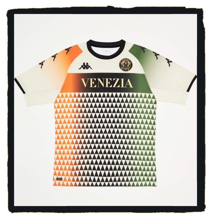
Here we see the the club’s orange and green colours move across the shirt like the light of the morning sun.
To our eyes. the faded gradient that plays out from left to right brings to mind Kappa’s classic South Africa shirts, but we’re told this is officially inspired by Venetian mosaics.
Whatever the inspiration, this is a stunning piece of kit, every bit as attractive as the models Venezia have used in their photo-shoot.
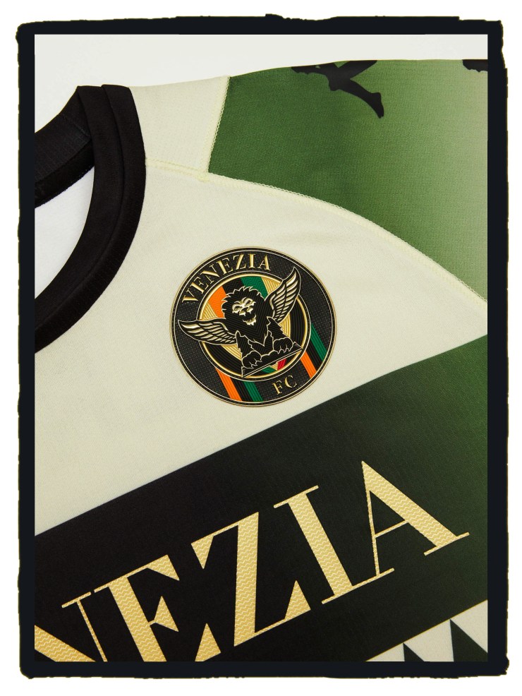
Interestingly, the two shirts feature different versions of Venezia’s winged-lion badge which perhaps hints towards the tight timescales the design teams at Fly Nowhere and Kappa were working towards and what may have been had they had the bandwidth to take the club’s emblem in a new direction.
We’ll stand back from any “best shirt ever” proclamation you might find in other publications but this is certainly a collaboration that has left us wanting more and represents a bang-on-form brand in Kappa.


