One of our favourite examples of late ’90s Sartorial Soccer elegance is Manchester City’s laser blue home kit by Kappa.
Kappa were still a rare commodity in UK football kit circles when they brought a touch of Italian flair to Maine Road for the 1997-98 season.
Worn for two seasons that featured relegation to League One and subsequent promotion back to the Championship via the Play-Offs, the shirts featured the same “Kappa slapper” trim as seen on the track-suits worn on each and every one of Britain’s street corners at the time. Not necessarily a selling point we grant you.
Kappa replaced local boys Umbro who had supplied the Citizens’ shirts for generations and ushered in a clear change in direction for City kits.
“NEW CREST”
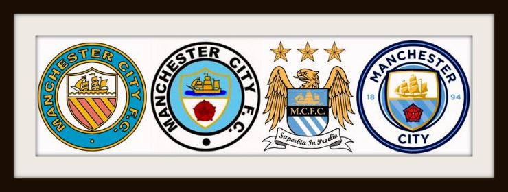
As well as the departure from the Citizens’ familiar shade of light blue towards a more dynamic, almost highlighter pen tone known as laser blue; Kappa’s shirts were the first to carry the club’s new crest on their chest.

City unveiled a new badge in 1997 having wrestled with image property rights on the old circular badge for years, before finding it couldn’t be trademarked.
The shape of the crest changed with a golden eagle dominating the new design.
The eagle, an old heraldic symbol of the city of Manchester, referenced the city’s aviation industry whilst the more traditional ship which has adorned both City and United shirts for decades, represented the docks.
Other than the latin scroll which just seemed like it was trying too hard, the feature which provoked the most ire from fans of City and rival clubs, was the presence of three decorative stars above the eagle.
Stars on club shirts usually reference European silverware or in the case of Italian giants Juventus, their 3 stars boast 30 league titles.
The golden eagle badge was never truly accepted by the City faithful but stayed in place until 2016 when an updated version of the circular crest was introduced following consultation with fans.
“OH BROTHER, WHERE FOR ART THOU?”
Worn by the Georgian genius Georgi Kinkladze and cult hero Shaun Goater, Kappa’s kits were the last shirts to carry Brother as sponsors.

As well as this classic home shirt, Kappa produced two fine away kits, one of which was worn at Wembley Stadium as City stormed back to the Championship after a Lazarus style recovery against Gillingham, who had been 2-0 up entering the final minute of the game.
City won that final on penalties and began the climb back up the league towards the move to the Etihad Stadium, the vast investment from Sheikh Mansour, and the look on Sir Alex Fergusons face on 13 May 2012 when word reached him that Sergio Aguero had given his “noisy neighbours” their first league title since 1968.
This was certainly a design that flies in the face of the theory that great shirts should be associated with great moments of glory.
When City wore this classic shirt in the lower reaches of the Championship and slummed it in League One, few could have predicted what the coming years would hold for the club.
For its radical design and place in Manchester City’s modern history, this shirt is rightfully regarded as a classic of the time.
