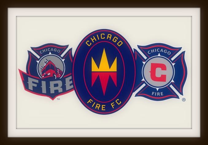
Chicago Fire completed a comprehensive re-branding this week, with badge, colours and even the club’s name all modified to signify a new era for the MLS side.
The 2020 season will witness the Fire’s return to Soldier Field and central Chicago, after 13 years away at the out of town SeatGeek Stadium.
Under the ownership of financial services billionaire Joe Mansueto, the club’s fans are looking forward to the new campaign with a renewed sense of optimism.
A new look, for a brand new start. What could possibly go wrong?

The re-branding exercise sees Chicago Fire drop “Soccer” from their official title with the adoption of the more internationally focused “Football Club” instead.
Meanwhile grey is replaced by gold in an update of club colours which may ultimately see the Men in Red play in navy blue.
The Fire take their name from the tragedy of 1871 that claimed close to 300 lives and have proudly worn a badge modelled on the St Florian’s Cross symbol of the city’s fire brigade since their foundation in 1998.
Mansueto said, “I’ve always loved the Chicago Fire name. I think of the people who rolled up their sleeves and committed to rebuild what would become a world-class city.”

The link to Chicago’s finest becomes far more nuanced with the new crest’s introduction of a symbolic “Fire Crown” device which has drawn criticism from some Chicagoans for its resemblance to the markings of gang culture, and in particular; the notorious Latin Kings who grew from the city in the 1950s.
Aside from what may be an unfortunate misjudgment of the local criminal fraternity, fans will feel aggrieved that they were not fully consulted on the introduction of the simplified oval badge.
Although a comparatively young league, MLS fans are proud of the passion and culture that has developed around soccer in North America. Fans are hugely invested in their clubs because they helped to build them in their own lifetimes.

The Fire were among Major League Soccer’s first expansion clubs back in 1998, and won the MLS Cup and US Open Cup double in their first season, but have struggled in recent years, only making the end of season play-offs twice since 2010.
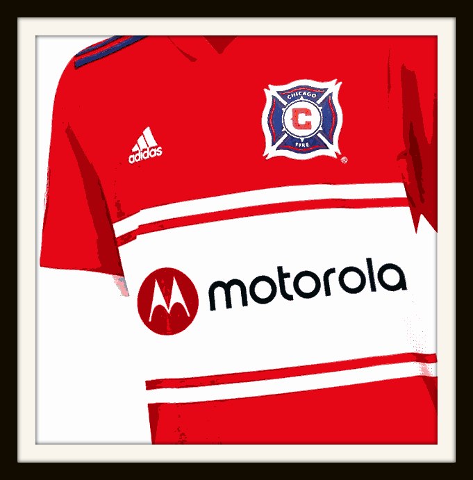
As younger franchises have dominated engraving space on major silverware, Chicago Fire were clearly in need of a refresh on and off the pitch. Uniforms have become more and more dull and for what it’s worth, we can’t wait to see the kits Adidas release for 2020 utilising that fresh and exciting new colour scheme.
The question here is whether the change of crest has been too radical, whether the design is too abstract to look like a badge of honour for supporters?

A football club’s badge is far more than just a piece of graphic design and it’s always a highly emotive subject when a club decides to change key symbols representing their soul, tradition and identity.
Supporters carry the imagery and icons of their devotion close to their hearts, often permanently committing space on their bodies to the passion they have for their club.
Time will tell whether the city of Chicago and her football fraternity simply get used to this new design or whether we see a swift return to an altogether more familiar theme for the Fire.
What do you think of Chicago Fire FC’s new visual identity?
Please let us know in the comments section below!

