Cobblers fan and commentator at 14 Olympic Games, Andy Bodfish takes us on a trip through six phases in the history of Northampton Town shirts.
Andy understands that sometimes the memories we associate with a kit are as important as the design principles behind them, so we were delighted when he suggested a nostalgic trip through some of Town’s favourite shirts from the County Ground to Sixfields.
Over to you Andy!
The George Best 1967 – 1973
With football shirt design only really getting interesting and diverse in the 1960s, Town’s own contribution to Swinging British Style was to rip up the claret-shirt-only rulebook and introduce this simple but smooth crew neck number with claret on white double bars, worn between 1967 and 1971 and then again in late season 72-73.
On the latter occasion it was paired with claret shorts, to my mind superior to the all-white combination, advertised unforgettably by George Best in his one-man dismantling of Town in the FA Cup.
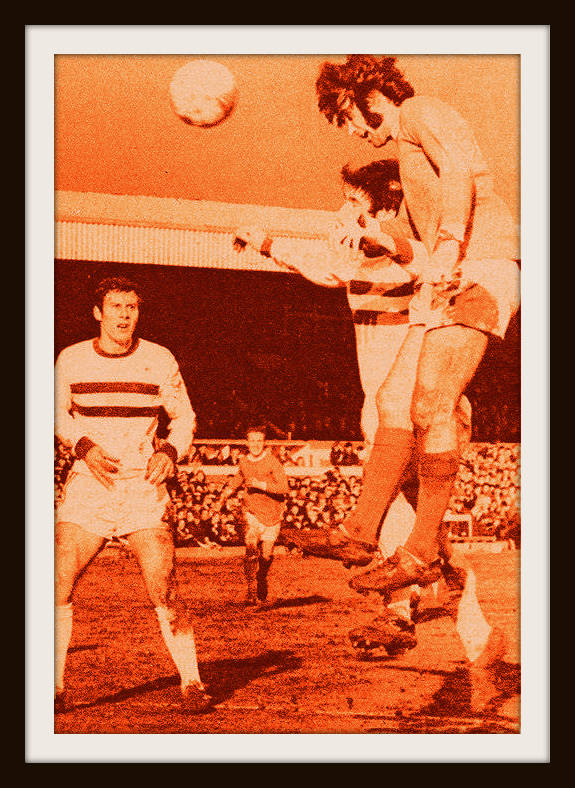
Plus this was the Sixties, so it was essential the jersey pattern would have looked good taking Twiggy for a nice pint of light ale down the Kings Road/Bridge Street later.
VERDICT: Understated 60s classic so smooth and understated no Kray would dare blade you for fear of getting claret on the claret.

The Liverpool 1983-85
For me this kit contained an essential ingredient: aspiration.
It was basically Liverpool’s Umbro with the colour notch altered to claret and my own personal love of a pinstripe sees it enter the upper echelons.

The ideal strip with which to go all-claret for the first time in over a decade, but the Hotel End was not the Kop and some truly low days were associated with this number, including the lowest home attendance in the clubs history and a finish of 91st of 92 in the football league.
VERDICT: Shame. A mirror image of Liverpool. They were top of the league, Town were bottom.
The Glory Days 1986-87
Its naturally true that success on the pitch has positive memories for certain shirts and . . . that’s an understatement when it comes to 86-87.
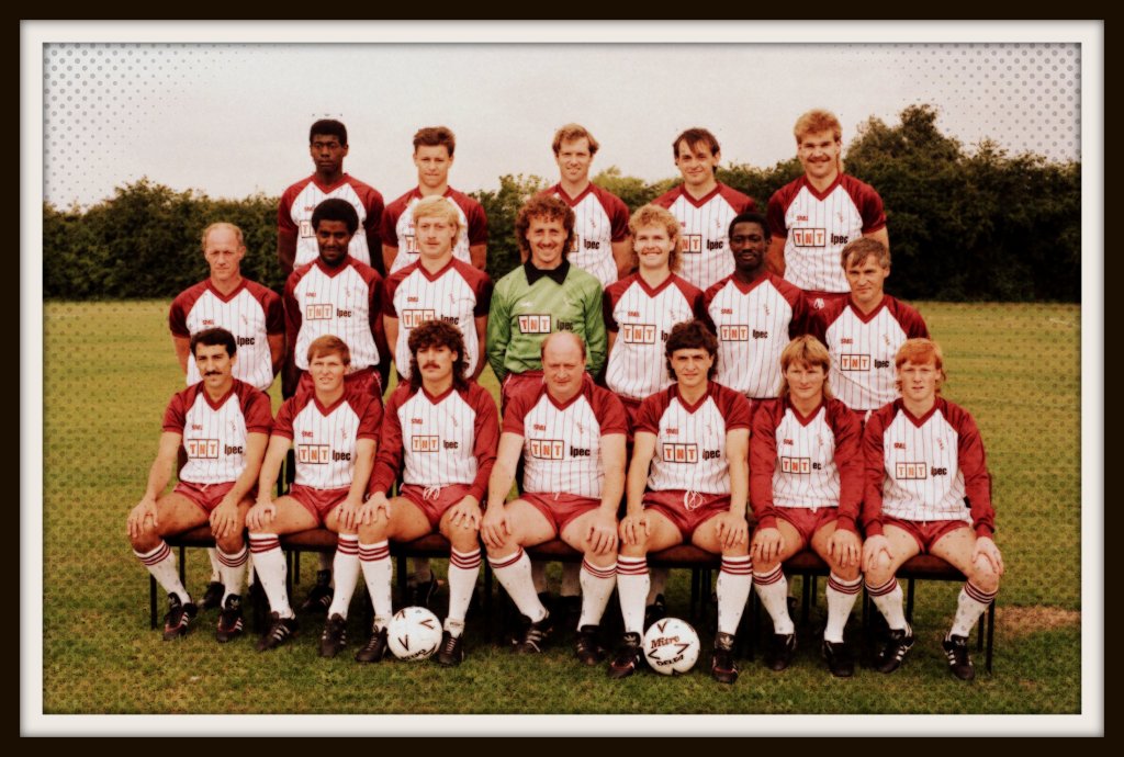
Who knows if this Spall shirt would have just retreated back to happy obscurity. But it didn’t, because wearing it, Richard Hill had 20 goals by Christmas, the Cobblers won 20 of 23 home games, clocked 99 points and were crowned runaway champions long before the season was out.
Football Focus came down and everything (PS, beat THAT for being spoilt in your first-ever season following your local team!).

The claret shoulders and shorts are a great match and, if you have to have a sponsor, why not a strong local success story with a modest logo that was reassuringly vague and enigmatic about what it did.
Unlike, say, Carpet Supacentre.
VERDICT: Unforgettable season, unforgettable memories, unforgettable kit. They’re all linked.
The Lotto 1995-97
Britpop. Liam v Noel. Euro 96.
The mid-nineties were a great time to be alive and Cool Britannia found its way to the Rose of The Shires too in the form of The Lotto.

Donned by the likes of Martina Navratilova and a fresh-faced Boris Becker at Wimbledon, this Italian sportswear behemoth supplied and sponsored Town’s kit for two years in the mid-90s and it felt gooood.
The shoulder-detailed shirt from 95-96 – worn as the Ian Atkins revolution started to kick in – is certainly a style classic, but for sheer class I’ll plump for the plainer version from the following season.
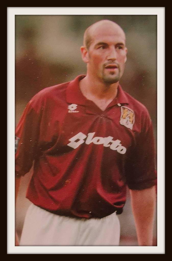
Like a decade before, the right sartorial choices were being reflected by success on the pitch, and come the end of 96-97 the club were doing ridiculous things like going to Wembley for the first time and winning play-off finals with last-minute free-kicks.
All cos of The Lotto.
VERDICT: John Frain scored THAT free-kick in this shirt. It was like Town had won the Lotto.

The Yellow 2008-09
The late noughties’ were an experimental time for Town home shirts – white left sleeve in 07-08; patches of white and black across the right shoulder and left flank in 09-10.
But in the intervening season Town struck gold, almost literally.
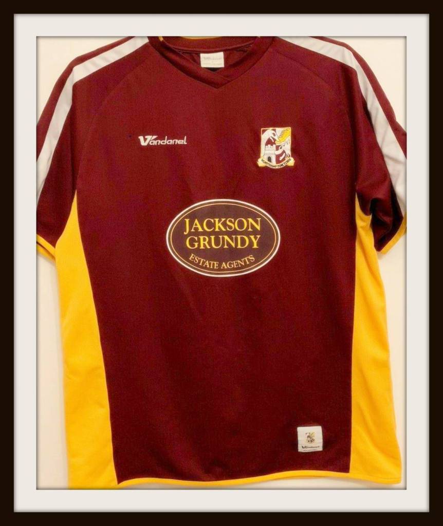
The addition of yellow on the shirt and shorts for the first time ever elevates this Vandanel kit, for me.
The risk of introducing a third colour paid off spectacularly, particularly with the yellow always likely to clash starkly with the claret if not combined correctly.

Sadly the team couldn’t do it justice, as just 12 months after finishing in their second-highest league position in over 40 years Town were relegated back to the bottom division wearing this kit as it all went wrong under Stuart Gray.
VERDICT: Glad to have seen you, and sorry it was so fleeting.
The Nike Era 2016-Date
The classic Town combination of claret shirts and white shorts seems now so essential to the clubs identity that another example deserves to join The Lotto on the list.
I had a real soft spot for the Errea Nationwide v-neck worn between 2002-03, and the subtle two-tone vertical stripe of 15-16 is a very fine garment indeed.
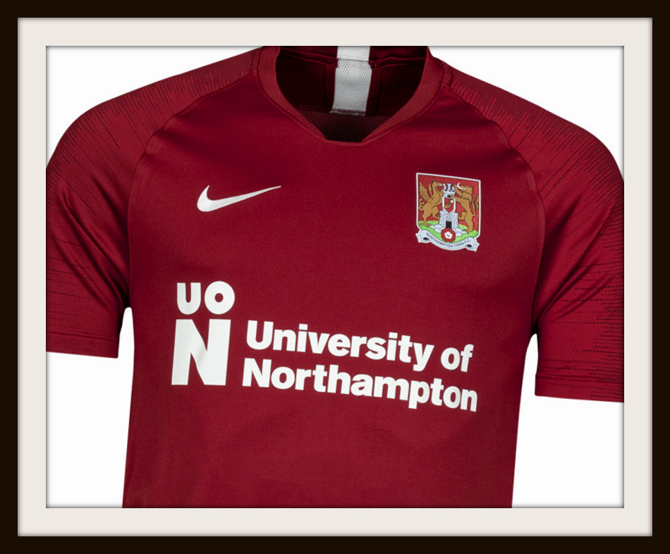
But the arrival of Nike as kit supplier in 2016 seemed to herald again a new era of hope, of aspiration, and the result has been to provide the club with a succession of straightforward but stone-cold classic designs.
From white shoulder stripes to the lovely, subtle diamond pattern woven into last season’s shirt and now the sleek, crisp basic lines of this seasons unfussy design, the Nike’s should comfortably stand the test of time, no matter what ends up happening up this season.
A play-off day out at Wembley, maybe, with custom-made Kappa tracksuit tops in claret and white with just the merest hint of yellow piping?
One can dream.
VERDICT: Strong shirts. Mixing with the Giants. Here’s to the future.

Massive thanks go to Andy Bodfish for taking a break from his preparations for the Tokyo 2020 Olympics (whenever they should be) to bring us these Cobblers club classics!
Make sure you follow Andy on Twitter here for more adventures and kit-talk from the commentary box!
If you have a football shirt story you think we should cover then please let us know in the comments section below!
