Nike’s 2020-21 Inter Milan shirts take a radical new direction with slithering zig-zag stripes that draw influence from a key symbol of the city they call home.
Following the inventive, diagonally-striped centre to last season’s strips and a season of leaks and rumours, Inter fans had been prepared for something completely different; making their 2020-21 home shirts one of the summer’s most hotly-anticipated new releases.
And they certainly don’t disappoint.

Nike have blurred the edges of Inter’s home shirts before, but their brand new meandering, zig-zag strip is their most ambitious shirt of their time at the San Siro.
According to Nike, the serpentine design “takes the bold colours and shapes of post-modernism” and uses them to “reimagine the famous Nerazzurri stripes in a pop style.”
After all, there’s only so many times you can introduce new colours to the collar and cuffs, only so many places you can position the Pirelli logo, and only so many ways you can vary the width of those stripes without coming up with the same Inter Milan kit twice.

Cynics may argue that after 20 years together, Nike have run out of things to say to Inter, and whilst searching for the “next Nigeria” they’ve flirted with the same detour made by last season’s controversial Barcelona and Juventus designs.
Different they may be, but the execution of these designs is far, far better than those Barça and Juve efforts.
In the words of Nike’s Scott Munson, the brand are “challenging the club’s traditional striped identity”, this time drawing inspiration from a powerful symbol of the city of Milan and the Internazionale club.
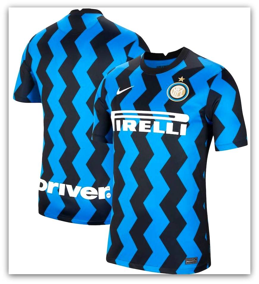
The thick black and blue waves and zig-zags, making their way across this highly individual and risky shirt are a representation of the Biscione, which has been synonymous with Milan for centuries.
The gruesome emblem of a coiled viper devouring a human being, dates back to the Crusades of the 12th Century when Ottone Visconti led an army of Milanese citizens in the siege of Jerusalem.
Legend has it that after Visconti challenged and defeated the fearsome Saracen Voluce in a duel, he took his opponent’s coat of arms back to Milan where he adopted them as his own.
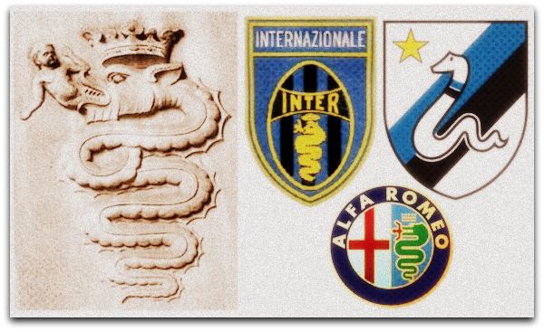
The large serpent eating a man (sometimes depicted as a child) became the symbol of the House of Visconti, and later the Renaissance period royalty of the House of Sforza, and even today the snake features on the logo of Milanese car-makers Alfa Romeo.
Football Club Internazionale Milano were founded in 1908 after separating from the club who would become rivals AC Milan.
The Biscione has at times featured as the club’s badge and aside from the infamous spell when Internazionale were forced by the Fascist party to change their name to Ambrosiana and play the 1928 season in a white shirt with a red cross, the club has always played in black and blue stripes, symbolising a dark night sky.

Whether you see Nike’s 2020-21 Inter shirt as a post-modern classic or a betrayal of club traditions depends on your perspective and how cynical you are as to the reasons given for the deviation away from one of football’s most iconic kits.
Lets embrace the difference and embrace an exciting era for football shirts.
This may go on to be remembered as a modern classic.
🛒 You can shop for this & all this season’s new releases at Kitbag.com. 🛒
