The year’s most talked-about (and argued-about) collection of kits has arrived via the unlikely source of superstar musician and artist, Pharrell Williams.
The multi-talented singer, producer, fashion designer and serial entrepreneur, follows Robbie Williams (no relation) into the world of football shirt design, with a collection of retro-style kits through his Human Race label’s partnership with Adidas.
Each of the shirts is made from recycled materials to reduce the burden of plastic waste and we’re told the designs are “inspired by and in celebration of the imperfect beauty of the human spirit.”
To some, these hand-painted designs are a refreshing change from the norm, a bit of fun and the ideal addition to any football shirt enthusiast’s collection.
To others, there’s a feeling that fans are being “had” and that there’s a hint of The Emperor’s New Clothes about them.
Manchester United, Arsenal, Juventus, Bayern Munich and Real Madrid each receive new interpretations of some of Adidas’ most popular works of art.
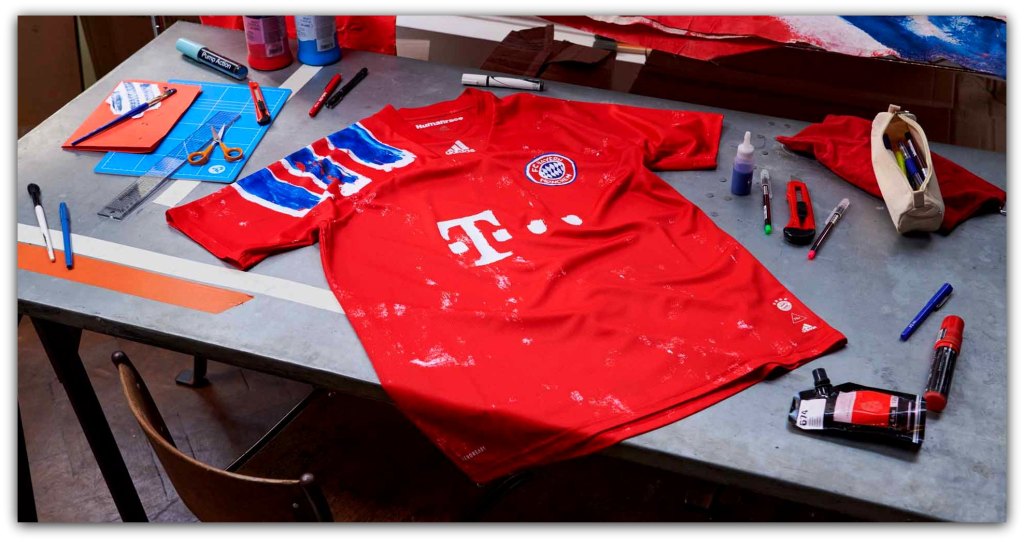
Of the five limited edition shirts, it’s Bayern Munich who Get Lucky.
This update of arguably the club’s most recognisable jersey – their iconic 1991-93 Adidas Equipment shirt – will reportedly be worn by Bayern in a DFB Pokal tie in December.
Whilst technically a “4th kit,” we’re pleased to see the return of blue to FCB’s home shirt pallette for the first time since 2018, when the club decreed, that in future, their tops would only ever be red and white.

Meanwhile, Juventus looked like they were getting ready for a stag do while Frontin’ their pink shirts on Sunday night for their 1-1 draw with Hellas Verona.
One of last season’s most celebrated kits was Adidas’ crossover with skateboard brand Palace that easily gave Juve their best shirt of the year; but this rough, tie-dye style shirt just doesn’t hold a candle to it.
We said they were meant to be imperfect didn’t we?

Manchester United’s 1990-92 “snowflake” print away shirt gets its own modern twist, which cunningly deploys Human Race’s own logo in HD, whilst scrappily sketching the club crest on the chest, in a move that will be sacrilege to many United fans.
Hero of our time Marcus Rashford and his Red Devils team-mates wore an adapted version of the design with sponsors AON’s name emblazoned across the midriff as a training top before the visit of Chelsea to Old Trafford at the weekend.
The thing is, with Manchester United’s dazzle-camo black and white third kit around, these just aren’t that shocking.

The “love it or hate it” cult status of Arsenal’s 1991-93 bruised banana was apparently Pharrell’s first choice for the collection, and this is a game of two halves for the Gunners.
If you squint and look at it through the bottom of a milk bottle, the top half looks like a fair reflection of one of the most iconic football shirt designs of the last 30 years.
However, the lower portion seems to be the faded, homemade product of a Holloway Road hippy commune.
All of that said, we’re not sure this is any worse than this season’s “Patrick Bateman” away shirt.

When Japanese fashion designer Yohji Yamamoto joined forces with Adidas to launch their Y3 range of trainers in 2003, it was one of the first crossovers between the worlds of high fashion and sportswear.
Then, in 2014, Adidas turned to Yamamoto, to produce a kit for Real Madrid, with his design delivering a third shirt dripping in mythology and symbolism.
His black shirts featured a monochrome representation of a bird and a “king’s dragon” to symbolise glory, honour, greatness, and speed.
So predictably enough, with that kind of set-up, the shirts coincided with a largely forgettable season at the Santiago Bernabéu which ended with Carlo Ancelotti getting the sack.
Reimagined by Human Race’s design team with a smudged, watery effect, this is a crossover of a crossover (if that’s such a thing).

Pharrell Williams has been working with with Adidas since 2014 and speaking about the collection, he said;
“History is what shapes the future, and sometimes in order to look forwards, first we need to look back.
“The most important part of the process with this collection was to learn of each club’s legacies and how each defining moment of their histories were captured and preserved from a design perspective.
“Each of the new jerseys are symbols of the five club’s legacies and a true celebration of the universality of sport.”

Pharrell’s not known for making cover-versions but if people are Happy to splash out on his Human Race label’s partnership with Adidas, then who are we to argue?
Whilst we’re just not that in to these, the fact that Pharrell is expressing himself through the medium of kits shows how far we’ve come since the “everyone looks the same” days of stale templates which reached a nadir at Euro 2016.
As much as these designs are not traditional football shirts, they’re not really aimed at your average supporter either and in a year when Inter Milan’s stripes zig-zagged; they very much fit in to the disruptive chaos of 2020.
