Friend of Sartorial.Soccer Garry Bacon returns with the scoop on Providence City’s long-awaited line-up for 2021.
Anticipation. Suspense. Waiting. Patience.
In a world of instant ‘content’, and the often overwhelming feeling of a constant bombardment of information being thrown at you, it’s nice to have something to look forward to.
And in the world of football shirts, a Providence City FC unveiling is ALWAYS a time of true excitement, and one to mark in the ‘shirt calendar’.
Building suspense over the last few weeks, their 2021 Home and Away shirts are finally here.
It’s quite remarkable that a club (only 6 years deep in this remember) have contributed so many classic shirts in that time to the football shirt market.

From the HAMR, to the Good Night Lights, to the Treat Yo’ Self, they, along with designers Inaria, continue to push forward and create unique, innovative designs that impress on first glimpse, and leave a lasting impression.
And they’ve done it again.
No mercy is what The Rogues have been showing their opponents the last few years, amassing an impressive array of championships in their short history, and now they have the shirt to match.
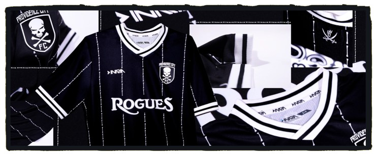
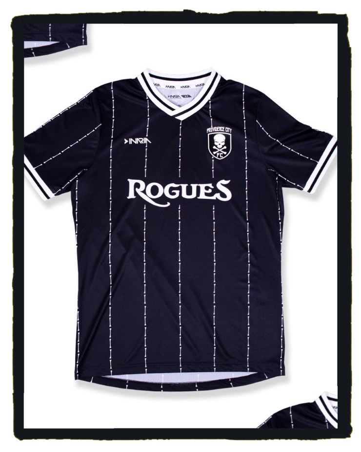
The No Quarter Home shirt draws on inspiration from local Rhode Island pirates such as Thomas Tew, to create a shirt that will strike fear into the hardiest of foes.

In their words:
“Much like the visceral terror that must’ve accompanied the sight of Thomas Tew’s oncoming vessel, this year’s kit features a scattering of human bones, drawn swords, and the self-proclamation of being a Rogue emblazoned across the chest.”
The shirt helps embody the Rogue spirit: Never give up, never settle, never show mercy. Show no quarter.
Inaria have finished this beauty with a lovely wide collar and cuffs on the sleeve to cap off an absolute winner.
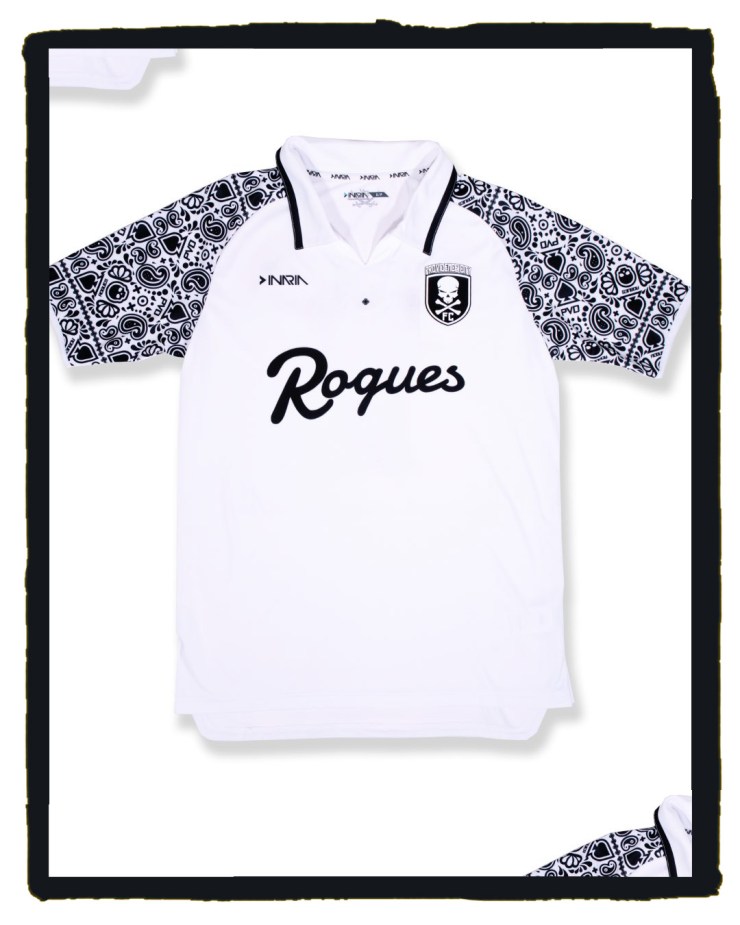
But no matter how good that is, the Death By Paisley Away shirt wins this round, and may be the best shirt released this year.

Like the Manchester City ‘paisley’ shirt, but think it could’ve been refined and improved? Well Inaria have done that, and then some.
Against a crisp white shirt, the paisley design of Spades, Skulls, PVD and Rogue symbols pop out to create a unique effort which continues the rich theme of out there designs that fans have come to expect from both club and manufacturer, whilst ensuring they keep their well earned spot at the very top of the shirt game.
The city of Providence continues to be Rhode Island’s ‘Creative Capital’ and PCFC still have the best US club shirts, and they have thrown down the gauntlet again.

Question is: Who is going to come near their crown when they continue to release kits this good?
Inaria and the club have already delivered classic after classic, and seem to be incredibly well attuned to one another, so it’s genuinely exciting for football shirt fans to see where this partnership goes from here.
And it just may be that their influence is being recognised in the higher echelons of Stateside soccer.
As a reaction to the more esoteric offerings typified by Providence City and lower-league US soccer clubs, this season’s MLS kits are finally shrugging-off the tired adidas templates of the past few years to reveal an exciting line-up for 2021, and we can’t help but hold The Rogues and Inaria partly responsible.
Long live creativity. Long live risk taking. Long live The Rogues.
Follow Garry Bacon here.

More from Sartorial.Soccer
Kit of the Week #76: Doughnuts About Providence City!
We don’t doubt that this roguish design will be far too sweet for some to stomach, but we find these tasty little treats irresistible.
Stateside Sartorial Soccer Statements
Making his Sartorial.Soccer debut, Spurs fan Garry Bacon takes a look at three of the more esoteric shirts on display in the US of A.
Kit of the Week #61: A New Wave for Forward Madison
Forward Madison’s new alternate jersey perfectly captures the independent, new wave spirit sweeping through the game Stateside.


