Euro 2016 was generally a low point for football shirts.
As international tournaments go, it was arguably the lowest of the low.
As the visual aesthetic made way for functionality, we saw a proliferation of dreaded template shirts across the expanded tournament.
The technology behind player-issue kits had never been more advanced, it was just that . . . well . . . everyone . . . sort of . . . looked the same really.
Nike’s collection of kits were particularly dull and if you’re English, then any recollection of red socks, white shorts and light blue sleeves will leave you shivering in a corner trying to forget Iceland’s Thunderclap.
There were exceptions to the uniformity of that European Championships, with adidas serving up some fine designs for their nations.
This belter of a Belgium away kit was a fine example of their fare and will always be fondly remembered by Wales fans who will see Hal Robson-Kanu in their mind’s eye when they look at this.
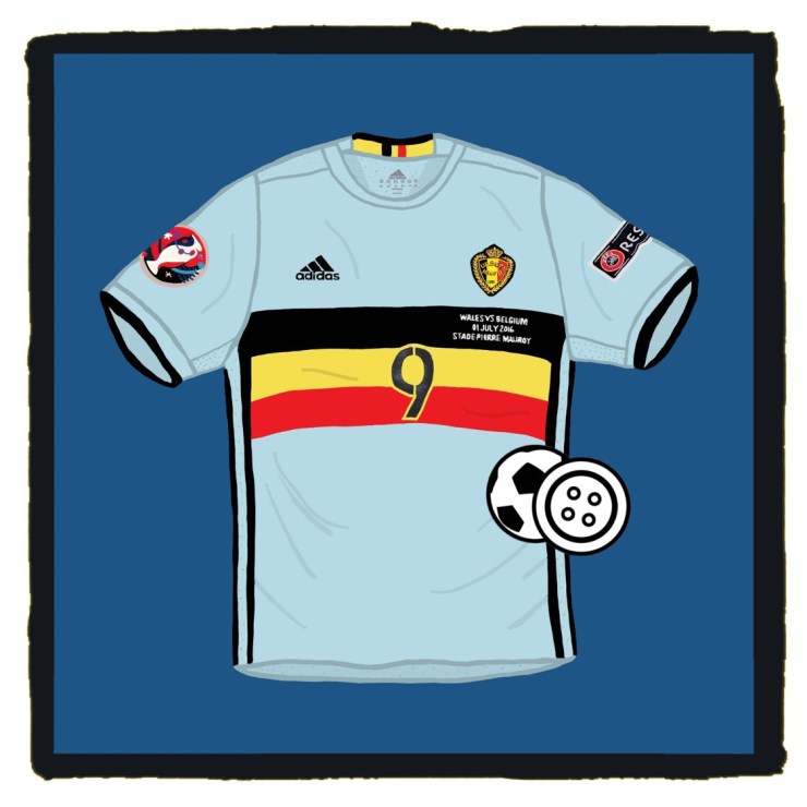
Based on the colours of the Belgian national cycling team, this is a modern football shirt that doesn’t need gimmicks to make it work.
This is all about smart execution and use of colour.
The Netherlands have projected their flag onto the backdrop of a light blue shirt in the past and the idea worked so well for Belgium that we were left wondering why the Red Devils don’t always wear these as their change colours?

Paired with black shorts (sometimes blue) and light, baby blue socks, the whole kit is a masterstroke but it’s that shirt that does it for us.
Let’s face it, Belgium haven’t always looked quite this good, but this is every bit as sexy as chocolate, beer and frites with saxophone music playing in the background.
This is a modern classic of a football shirt.


