QPR grabbed a last-gasp victory over West Brom on Saturday afternoon, in a kit that’s been 140 years in the making.
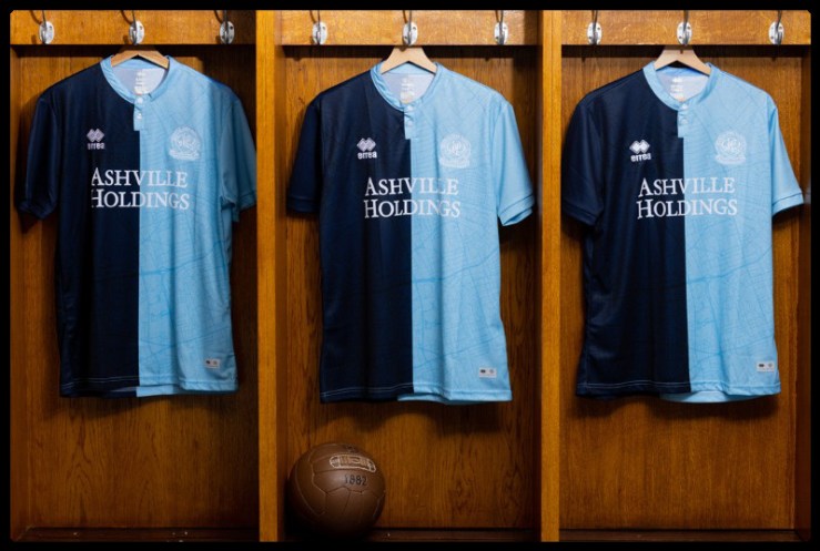
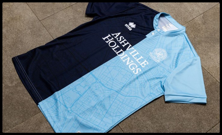
Based on the original colours worn by Christchurch Rangers, who would go on to merge with St Jude’s Institute to form the club we know today back in 1886; the modern kit from Erreà is made up of halved shirts in Oxford and Cambridge blues, white shorts and navy socks.
Printed into the fabric of this neat, mandarin collared shirt is the outline of an old street map of the club’s spiritual home, the Queen’s Park estate, with the location of St. Jude’s Church located close to the crest.
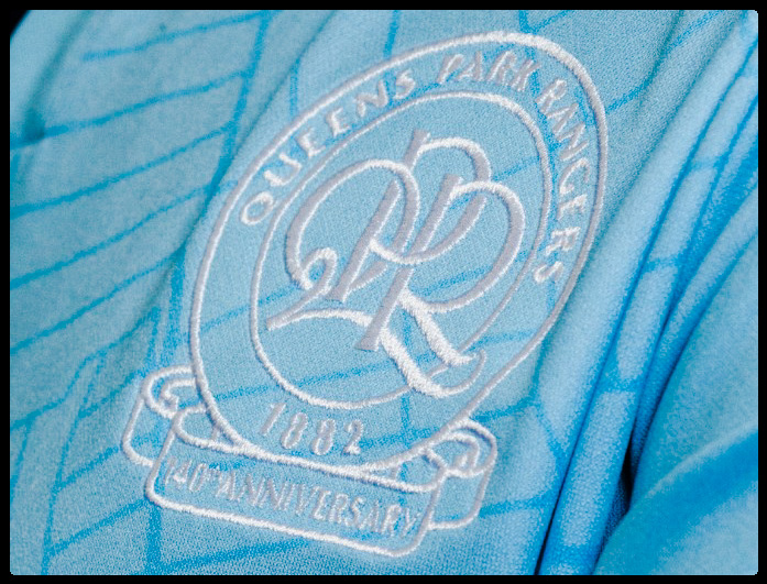
Designed by lifelong QPR fans Daniel Norris and Dan Bowyer, the crest itself is another commemorative feature with the return of a scroll underneath the badge to mark the 140 years.
The light and navy blues of those original Christchurch Rangers colours, was based on those of the Oxford and Cambridge universities who owned the large swathes of West London land that would later be developed into the avenues and streets of the neighbourhood.
There’s some contention among R’s fans and local historians around whether the club was established in 1882 or 1886, but officially at least, the club ties its date of birth to the foundation of Christchurch Rangers at the earlier date.
When the two clubs joined forces to represent Queens Park, they couldn’t have imagined that 14 decades on, their varsity inspired colours would be worn by the modern Queens Park Rangers side, and star in a victory that keeps them in the hunt for automatic promotion back to the Premier League.
The match-worn jerseys from Saturday’s fixture will be signed and auctioned to help raise funds for Prostate Cancer UK, and after an initial, limited edition run that sold-out on an overloaded club website; QPR will release a second batch to pre-order on Monday 24th of January.
Some might say that the drawing of maps into football shirts is an overdone trend, but when they look as good as this and help tell a story that links 1882 with 2022; you won’t find many R’s fans complaining.
What do you think of QPR’s 140th anniversary shirt by Erreà?
Please let us know in the comments below!