Manchester City marked their 125th anniversary with a special set of shirts for their Community Shield victory over Liverpool at Wembley.
With a classic white round-neck and unsullied by corporate sponsors, City’s one-off shirts were a throw-back to simpler shirt designs and made fans wonder why kit designs can’t always be so easy?

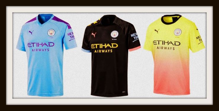
The plain retro elegance of the Community Shield shirts was in contrast to Puma’s first set of strips for City, which sang of the industrial revolution, the Haçienda and what we can only describe as McDonald’s milkshakes.
Now don’t get us wrong, we love at least two of Manchester City’s 2019-20 kits but there will certainly be fans who yearn for the limited-edition throwback designs to be used for the whole of the coming season.
This Manchester City anniversary kit gave us all a glimpse of the past glory of football shirts and perhaps unintentionally returned to another football kit theme of yore.
There was a time before modern materials, when footballers showed their efforts in the form of sweat on their shirts.
Pele was a master of it. Equally, the Italian World Cup winning side from 1982.

Since then, manufacturers have concentrated as much on the performance element of kits as the design aesthetic and we’re constantly told in launch statements how next-generation fabrics wick away sweat and heat to make players more comfortable.
Puma may have momentarily forgotten about that in the rush to produce the shirts, leaving Gabriel Jesus, Raheem Sterling and Kevin De Bruyne with damp patches all over the place.
Contributing to the retro-vibe was the discreet placement of Etihad and Puma’s logos on the sleeves, and whilst convincing them not to emblazon their name across the middle of Manchester City’s famous sky-blue shirts as a one off statement is one thing; taking them away for a whole season is sadly quite another.
As we raise the curtain on another season at Sartorial Soccer, Puma’s successful celebration of classic football shirts certainly deserves to be named Kit of the Week.
