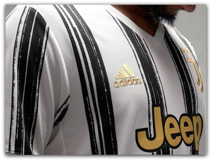
Juventus have signalled the return to their famous black and white stripes for the 2020-21 season.
Well, sort of.

After last season’s half and half shirts divided fans down the middle, just like that funny pink stripe, Adidas’ new kits use the same brushstroke technique seen daubed across many of their recent designs.
The irregular strokes symbolise the natural expressive flair of art and football, whilst the shirt’s gold details presumably reflect La Vecchia Signora’s onward pursuit of their 10th successive Serie A title next term.
These are not for the traditionalists, but they’re certainly growing on us.

The v-neck collar in white gives a cleaner look and whether you love or loathe the painted stripes, the overall results are closer to the image we have in our heads of what I Bianconeri shirts should look like.
In fact, if you squint, you can almost see “Ariston” written across the middle.
Go on, try it.

Nobody could accuse Adidas or Juve of playing it safe when it comes to design, and the new shirts feature a further evolution of the modern “J” badge and the removal of the word “Juventus” from the top of the crest.
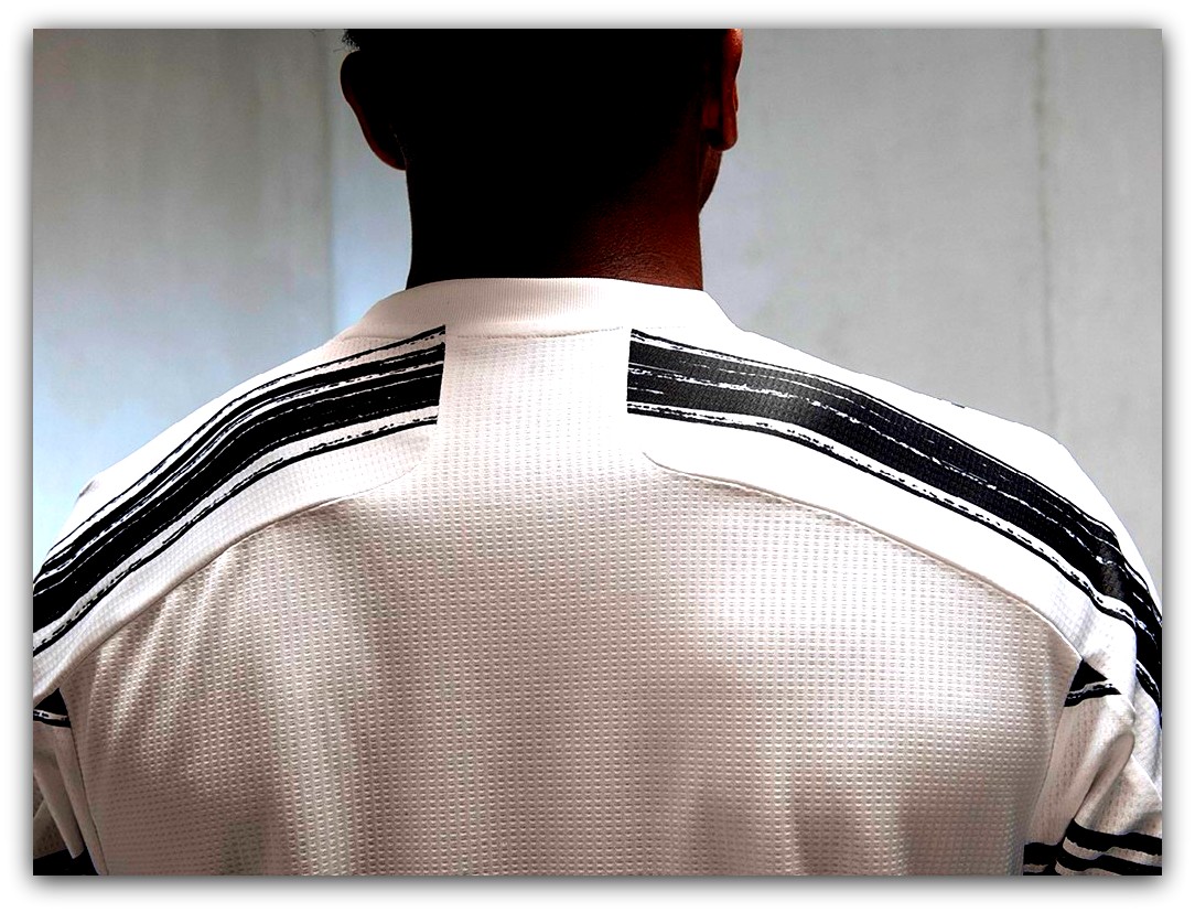
Aside from two horizontal stripes running across the shoulders, the back of the shirt is left blank for names and numbers to be printed.

Critics will say that the club have abandoned their principles in the pursuit of sales and that the stripes look more like greasy tyre-tracks than fine art in the form of a football shirt.
First impressions count for a lot, but whilst we never really changed our view on last season’s appalling halves, we’re starting to think there may be a stroke of genius in these new painted stripes.

A return to a more traditional striped look may come with next season’s strips, but for now, the partnership between Juve and Adidas continues to push that envelope of creativity.
🛒 Juve’s bold brushstrokes are available to buy from Kitbag.com. 🛒

