Puma have released a collection of new kits that challenge the way a football shirt should look, leaving fans of 10 European clubs with one key question; what on Earth have they done with our [insert your own expletive here] badge?
Across the history of the game, brands as diverse as Bukta, Umbro, Admiral, adidas, Nike and Kappa have challenged the fabric and style of the kits worn by our heroes.
At each stage, there were those who complained, mockingly rolling their eyes at designs football fans have now come to cherish.
Think of England in ’82, Denmark in ’86, West Germany and Holland in ’88, Italy in 2000. Imagine for a moment, that Brazil still wore white?
There are countless examples of where a designer’s vision was lambasted and ridiculed on release, only to be applauded when those brave new ideas went on to become a glorious part of our shared sporting heritage.
Football is of course a game of victory and defeat, so whether Puma’s collection of third shirts goes on to be acclaimed by future generations, or filed away with those laughably bad Leeds United sock-tags, remains to be seen.
The difference here, is that even before a ball was kicked, these just felt a little too cold, calculated and dare we say it, rude.
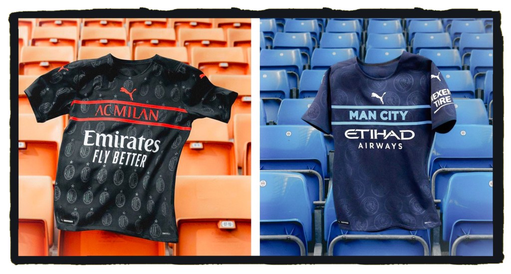
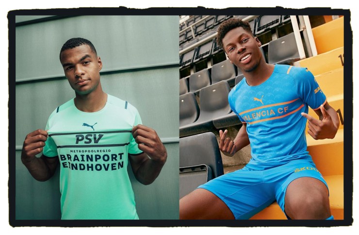
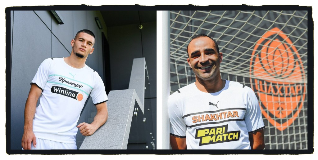
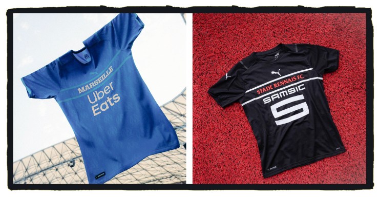
The 2021-22 third shirts for Manchester City, Milan, Marseille, Fenerbahce, Valencia, Borussia Mönchengladbach, PSV Eindhoven, Shakhtar Donetsk, Stade Rennais and FC Krasnodar follow a similar brief to the controversial away kits worn by Italy, Switzerland, Czech Republic and Austria at Euro 2020.
As with those international shirts, Puma have played with the placement of something that should be sacred on a football shirt – the crest.
Instead of positioning the badge right at the heart of the shirt, this collection centres around the name of each club . . . and if we’re not being too cynical here . . . Puma’s own big cat logo.
Ok, each badge is neatly woven into the engineered material of the shirt to create a luxurious shadow pattern, but the whole thing still feels like a relegation for club identity and a general lack of respect.
In Puma’s defence, a club crest can go through a number of iterations and changes over the years and the one true constant should be the name of the team we support, but the application feels problematic.
For example, can we not afford to call Manchester City by their full name on their shirt or drop the “AC” from Milan on theirs?
Furthermore, despite what fans of Borussia Mönchengladbach might tell you, there is not only one Borussia, yet that is the name we have emblazoned across their black alternative strip.
To ascertain that this is a piece of Gladbach kit rather than Dortmund, we need to know that Die Fohlen are sponsored by an online FX broker.
Kind of ruins the romance don’t you think?
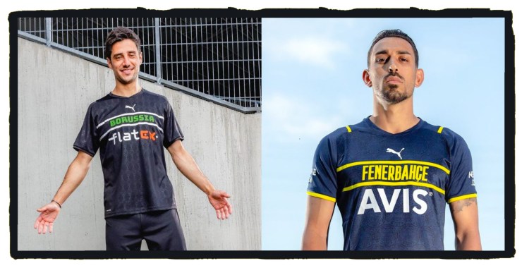
If rumours are to be believed, Borussia Dortmund were due to receive their own version of the template until disgusted fans reacted to leaked images of the design by demanding their club go nowhere near anything that refused to put their badge front and centre of the shirt.
Yet, if a club has signed a lucrative deal with a firm and agreed to 3 or more new kits per-season; why shouldn’t they allow their manufacturers’ design team a chance to do their own thing with at least one of them and trust the company’s commercial instincts?
After all, Nike have toasted their own brand heritage in recent seasons with collections of 3rd shirts inspired by Air Max trainers and their 1990s back catalogue, but nothing pushed the boundaries of acceptability quite as far as Puma have here.
So should clubs with traditions as established as Milan, Marseille and PSV not defend their identity in the same way Borussia Dortmund are reported to have done?
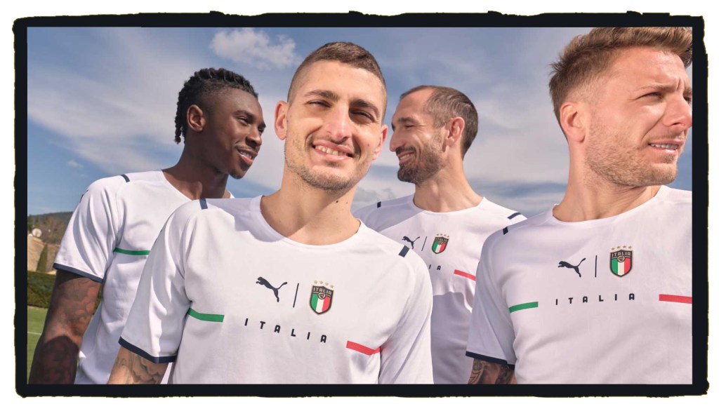
If one of Puma’s brave new designs for 2021 works, then it is undoubtedly that of European Champions, Italy and we can’t work out why these shirts can’t follow the same standard.
Whilst it may not have been love at first sight and they were originally compared to training kit, the key elements of a football shirt were there and the introduction of Italia between two lines forming the national flag combined to give a bold look.
Of course it helps when you can play a bit and look as great as they do, but we suspect the Azzurri may have been quite protective around the presence of their badge of honour on their clean, minimalist new kit.
Italians just do it better don’t they?
We’ve already seen comical episodes with confused players searching for a badge to kiss, but if this really is a publicity stunt, it’s certainly got the world talking about Puma and we all know that what’s wildly different, generally sells well.
Overall, when each team’s name is placed between Puma’s big cat and a huge sponsor’s logo, this is all feels a little too corporate, but above any of that, rather than being the kind of designs that should appeal to brand conscious fashionistas; the overall execution of these shirts feels wide of the mark and has a whiff of the market-stall rip-offs you’ll find for sale at a dozen Oxford Street souvenir kiosks.
Had Puma applied the same sensitivity to the crest on these 10 designs as they had on that Italy away shirt, we might be carried along on this brave new wave.
This collection of kits is meant to push the boundaries of what a football shirt should look like and take us all in a radical new direction but sadly ends up with 10 teams basically looking the same.
What do you think of Puma’s new 3rd shirts?
Please let us know in the comments section below!


I like how brave those are. Certainly breaking new ground and I think it is for the better. Of course, the execution could be improved (like Italy) and I hope they do that in the following seasons.
LikeLiked by 1 person